
Juicebox.ai. Talent command center on cream paper.
- SaaS
- Light theme
- 13 colors
- 6 typefaces
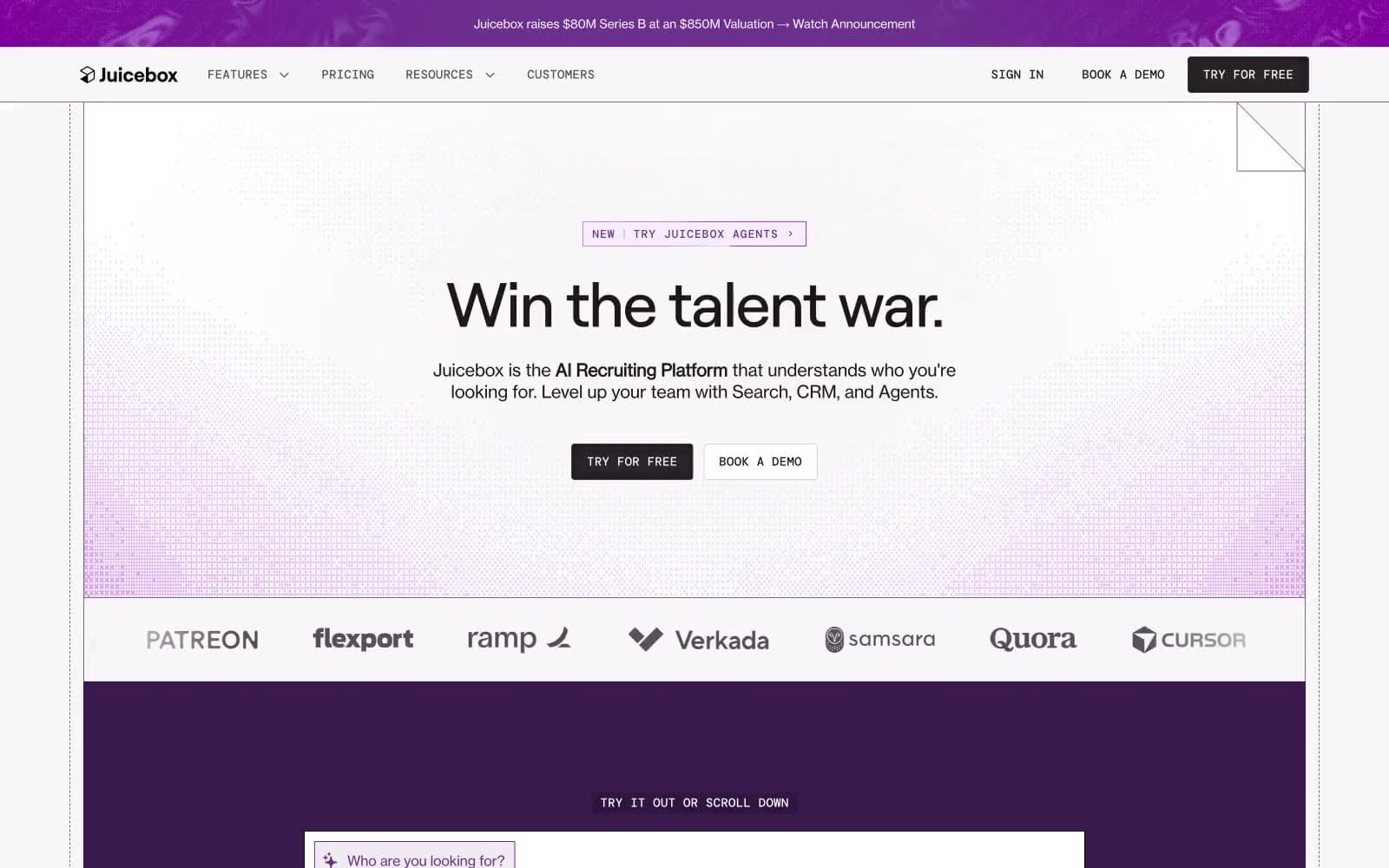
Juicebox operates in a talent-recruiting command center dialect: near-white canvas surfaces, a single saturated royal-purple that floods heroes and product frames, and tight, oversized serifless headlines that feel like executive memos rather than SaaS marketing. The interface is deliberately quiet — hairline borders, 2px radii, mono-spaced technical labels — so that the purple moments (hero washes, active tabs, product frames) feel like voltage jumps against an otherwise grayscale instrument panel. Body copy is set in a grotesque at 14–18px with slightly tightened tracking; display copy uses a neo-grotesque display face with aggressive negative letter-spacing at 40–72px that compresses headlines into confident, compact blocks. Components are compact, rectangular, and unornamented: no rounded pills, no drop shadows, no gradients on controls. Elevation is implied by surface lightness and a single inset shadow reserved for active/pressed states.
Juicebox.ai design system

Brand1
Primary brand color — hero washes, product frames, active nav indicator, link accents, and decorative section bands. Carries 100% of the chromatic brand weight; the system is monochrome until this color appears
Accent3
Tinted lilac surface used for soft product/section backgrounds and as the lightest stop in purple gradient washes. Pairs with Royal Plum to create a two-stop purple atmosphere without needing darker midtones
Decorative stroke accent — used sparingly on illustration outlines, diagram borders, and ornamental SVG marks that sit over plum surfaces
Green outline accent for tags, dividers, and focused UI edges
Neutrals9
Pure black reserved for SVG strokes, icon fills, and the deepest image borders. Not used for text or buttons — those live in the warmer Obsidian/Graphite family
Primary text and heading color. Slightly warm-tinted near-black that reads softer than pure #000 on cream backgrounds; the canonical ink for all reading content
Primary action button background (dark filled CTA) and deep border color. The non-chromatic counterpart to Royal Plum — same near-black temperature, used wherever a button needs to feel grounded and serious
Secondary text, input borders, form labels, and muted UI chrome. The mid-neutral that carries the majority of metadata and helper copy
Muted body text, tag labels, and tertiary borders. Reads as a soft taupe on cream — used for de-emphasized prose and quiet UI labels
Disabled text, placeholder copy, and the lightest readable neutral. Used where content must recede but remain legible
Default border color for cards, dividers, input fields, and table rows. The single hairline that draws almost every structural line on the site
Page background canvas — a warm near-white with a barely-perceptible violet cast that ties the neutral surface to the Royal Plum accent without competing with it
Card and elevated surface background. Sits one step brighter than Parchment to create a subtle two-tier surface stack without using shadows
Try a pairing
Pick any two colors from the palette to check whether text stays readable on top.
Aa
Paper on Royal Plum
8.74 : 1 contrast
- Body textPasses AA 4.5
- Large textPasses AA 3
- StrictPasses AAA 7























