
Intercom. Warm cream editorial spread.
- SaaS
- Light theme
- 13 colors
- 4 typefaces
Intercom's design language reads like an editorial magazine printed on warm cream paper: an off-white canvas (#faf9f6) replaces the cold SaaS gray, all body and display type sits at weight 300 for a whisper-light confidence, and a single vivid violet (#0007cb) does nearly all the chromatic work in small, deliberate doses. Sharp 4px corners on every control reject the rounded-softness trend in favor of architectural precision, and SaansMono at wide tracking acts as a labeling system — the way captions and tags function in print. Serrif at 300 weight appears inside body copy as a quiet editorial counterpoint, the one concession to typographic richness in an otherwise austere system. Components feel weightless: thin hairline borders in warm stone (#dedbd6), no decorative shadows, black-filled primary buttons that anchor without weight.
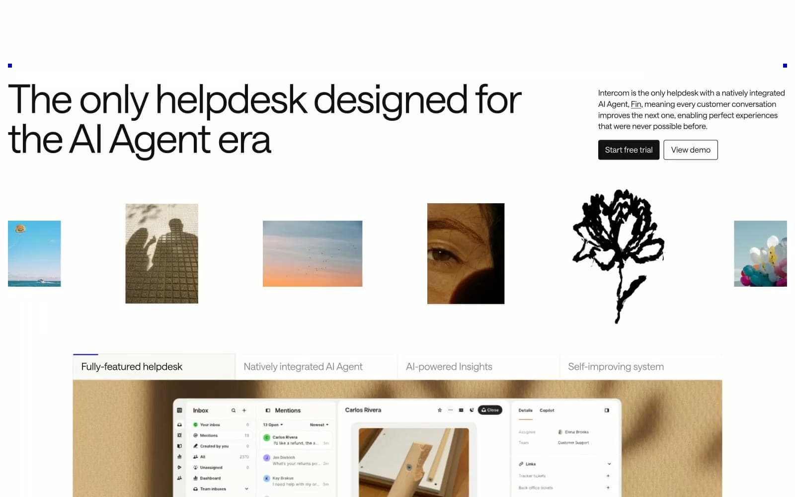
Intercom design system

Brand1
Brand accent — used sparingly for emphasis moments, selected icon strokes, and tag punctuation; the only saturated color in the system creates instant focus when it appears against the warm neutral canvas
Neutrals12
Dark supporting neutral for text, icons, and strong contrast. Do not promote it to the primary CTA color
Primary text, headings, body copy — slightly softer than pure black for comfortable reading on cream
Secondary text, supporting copy, muted descriptions
Tertiary text, helper copy, less-prominent body
Disabled state text, placeholder copy, very muted labels
Muted headings in secondary contexts, low-emphasis text
Icon strokes in resting state, low-emphasis glyphs
Decorative texture wash, large background fields, subtle warmth blocks
Hairline borders, dividers, input outlines, nav separators — the warm border tone that never feels cold
Secondary surface for sectioned blocks, elevated cards, and alternating content bands — one step warmer than canvas
Primary page canvas — the warm off-white that defines the entire surface temperature; every screen lives on this tone
Card surfaces, product screenshot backgrounds, inverted button text
Try a pairing
Pick any two colors from the palette to check whether text stays readable on top.
Aa
Pure White on Electric Violet
11.09 : 1 contrast
- Body textPasses AA 4.5
- Large textPasses AA 3
- StrictPasses AAA 7























