
Humble. A flat warm-white page where one vivid orange mark carries the entire brand voice.
- SaaS
- Light theme
- 10 colors
- 4 typefaces
Humble is a near-monochrome editorial system anchored by a single safety-orange accent. The canvas is warm off-white, type is set in Bricolage Grotesque with aggressive negative tracking that pulls the display sizes into poster-like blocks, and orange appears as a sharp marker-pen punctuation — a period at the end of a headline, a thin underline on a phrase, a flooded band between sections. Surfaces are flat with no shadows; hierarchy comes from generous whitespace, oversized type, and the orange accent that acts like a highlighter on a printed page. Components stay light: pill nav, ghost outlines, softly rounded product mockups, and dark filled CTAs that read as ink stamps rather than web buttons.
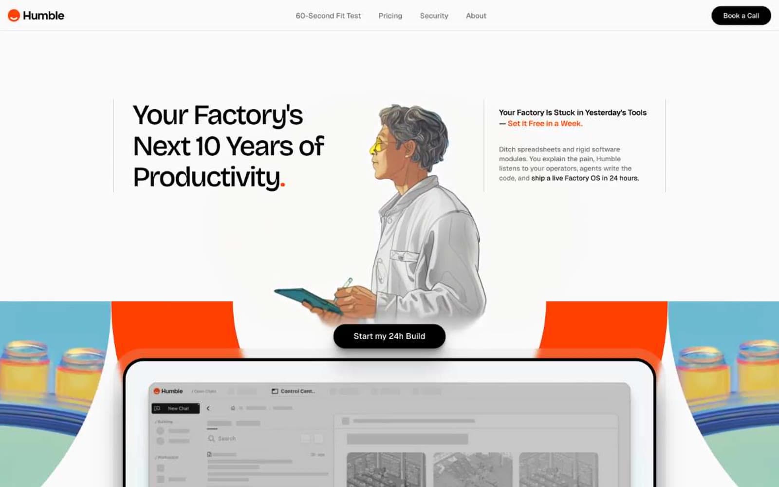
Humble design system

Brand1
Brand accent — terminal periods after display headlines, thin underlines on key phrases, small icon accents, and full-bleed section bands. This is the only chromatic color in the system; it must be used sparingly, like a highlighter on a printed page
Neutrals9
Dark borders and separators for elevated surfaces and inverted UI. Do not promote it to the primary CTA color
Heading text where pure black feels too harsh; gives display type a slightly softer, warmer read without losing the editorial weight
Body secondary text, nav inactive items, caption labels. The workhorse muted neutral for supporting copy and metadata
Lighter secondary text and subdued headings — used when Graphite would compete with body copy
Disabled state text, tertiary metadata, placeholder labels
Warmest card surface variant — used for product mockup containers and illustration cards that need a tactile, paper-like feel
Mid-tone surface for cards that need more separation from the Paper canvas without introducing a border
Page canvas and primary surface — the dominant background across all sections. Sits between pure white and cream to soften the high-contrast black typography
Warmest surface tint for elevated cards and feature blocks — barely a degree warmer than Paper, but enough to read as a distinct layer
Try a pairing
Pick any two colors from the palette to check whether text stays readable on top.
Aa
Ink Black on Safety Orange
5.99 : 1 contrast
- Body textPasses AA 4.5
- Large textPasses AA 3
- StrictFails AAA 7























