
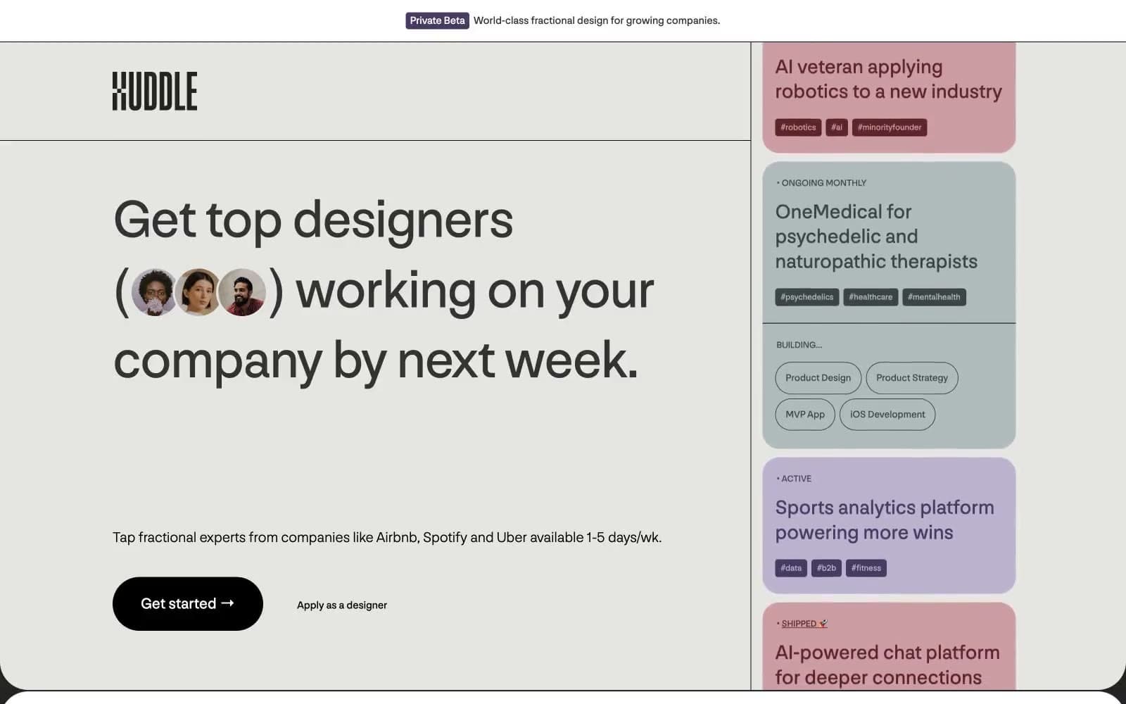
Huddle. Pastel inventory cards on cream paper.
- SaaS
- Light theme
- 15 colors
- 4 typefaces
Huddle uses a quiet, editorial curation language: off-white canvas, large confident headlines, and three muted pastel card colors (sage, lavender, dusty rose) that function as category tiles for project listings. The palette is intentionally desaturated — no vivid neons, no high-saturation accents — so the system reads as a considered directory rather than a marketplace. Typography is set in a single custom sans (Nng) that carries the entire information hierarchy, with all-caps micro-labels and dot-prefixed status tags adding a catalog/inventory feel. Components lean pill-shaped (100px radius on links, 1000px on primary buttons) and borders are thin 1px hairlines rather than heavy shadows, keeping the surface flat and poster-like.
Huddle design system

Brand2
Violet accent for outlined action borders, linked labels, and lightweight interactive emphasis.
Warm brown border accent on tags and badges — the signature warm neutral that anchors the cool pastels
Accent5
Hairline borders, dividers, input outlines, and card edges on light surfaces.
Lavender card variant — secondary project category, tag fills
Red state accent for badges, validation surfaces, and short status labels.
Gold accent for tag text, highlighted labels — the single warm highlight color
Soft pink border accent for rose-category cards and tags
Neutrals7
Dark borders and separators for elevated surfaces and inverted UI. Do not promote it to the primary CTA color
Secondary text, subtle borders
Hairline borders, dividers, card outlines
Muted text, inactive tags, form labels
Tertiary text, disabled states
Soft surface tint, secondary card backgrounds
Page canvas, card base, text on dark cards — the dominant surface
semantic1
Error/status red — badge backgrounds and warning borders
Try a pairing
Pick any two colors from the palette to check whether text stays readable on top.
Aa
Paper White on Deep Violet
10.26 : 1 contrast
- Body textPasses AA 4.5
- Large textPasses AA 3
- StrictPasses AAA 7























