
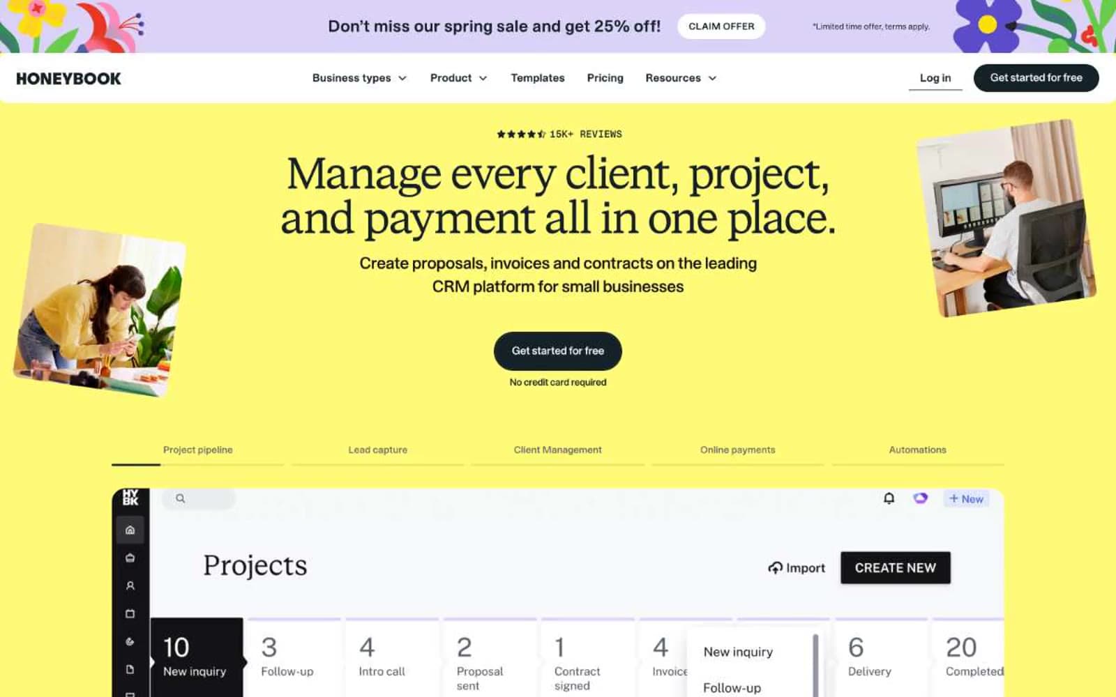
HoneyBook. A bright yellow marquee opening onto white workspace panels and dark pill stamps.
- SaaS
- Light theme
- 9 colors
- 3 typefaces
HoneyBook uses a sunlit-creative-studio language: a saturated sunshine-yellow hero, warm dark-navy text, and white product surfaces. The visual system is built on the tension between a serif display voice (STK Bureau Serif) and a confident geometric sans (STK Bureau Sans), with a tiny all-caps eyebrow face (STK Gerhard) that whispers 'editorial' above section headers. Buttons are absolute pills — fully rounded, dark-navy, no shadows — making actions feel like physical stamps pressed onto the page. Surfaces stay quiet and white below the fold; the yellow appears as a deliberate color block for hero/marquee moments rather than scattered decoration, creating a recognizable entry-and-rest rhythm across long pages.
HoneyBook design system

Brand2
Yellow wash for highlight backgrounds, decorative bands, and soft emphasis behind content.
Accent fills on cards, headline underline strokes, icon highlights, secondary callouts — slightly punchier sibling of Honey Yellow for moments that need to sit on white
Neutrals7
Body text and high-contrast borders on light surfaces, alt dark fill for emphasis blocks
Dark borders and separators for elevated surfaces and inverted UI. Do not promote it to the primary CTA color
Dark borders and separators for elevated surfaces and inverted UI. Do not promote it to the primary CTA color
Muted helper text, secondary metadata, low-emphasis captions
Card and link borders on white surfaces, hairline dividers — cool enough to feel distinct from the warm yellow system
Subtle borders, disabled state outlines, very light separators
Page and card surfaces, text on dark fills, primary button text
Try a pairing
Pick any two colors from the palette to check whether text stays readable on top.
Aa
Carbon on Honey Yellow
16.85 : 1 contrast
- Body textPasses AA 4.5
- Large textPasses AA 3
- StrictPasses AAA 7























