
Handshake. Neon highlighter on white paper.
- SaaS
- Light theme
- 7 colors
- 3 typefaces
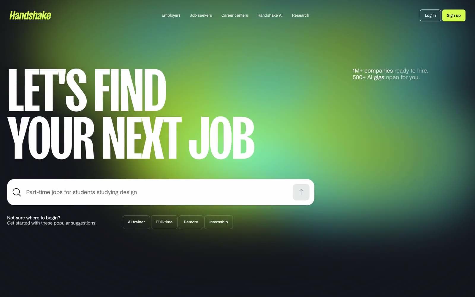
Handshake runs on a monochrome canvas punched open by one radioactive lime (#d3fb52) that acts less like a brand color and more like a highlighter dragged across white paper. The system is deliberately binary: almost everything is black text on white surfaces, and then the accent ignites — on nav pills, primary actions, and the hero's cyan-to-lime radial glow. Custom NoiGrotesk carries the UI with tight tracking and three stylistic sets (ss03, ss06, ss12) active everywhere, while SansPlomb at 201px declares the page in display headlines so large they feel architectural rather than typographic. Surfaces are pillow-soft (24px on cards and inputs), buttons are compact (8px), and the overall density is comfortable — the page breathes because the typography and gradient do the heavy emotional work, not ornament.
Handshake design system

Brand2
Primary action fill, nav pill, active state, hero gradient endpoint — the single chromatic ignition point against an otherwise monochrome system
Hero gradient start point, secondary glow tone — pairs with Voltage Lime to create the aurora-like radial background
Neutrals5
Nav borders, strong text emphasis, icon fills — used sparingly where maximum contrast is needed
Primary text, icon strokes, input borders — the slightly cool near-black used for the majority of foreground content
Footer surface, dark section backgrounds — a near-black with a subtle teal undertone that keeps the dark mode on-brand
Body helper text, muted body borders — the secondary text level for de-emphasized copy
Page canvas, card surfaces, button text on lime fills, input interiors — the dominant surface tone (1590+ appearances)
Try a pairing
Pick any two colors from the palette to check whether text stays readable on top.
Aa
True Black on Voltage Lime
17.69 : 1 contrast
- Body textPasses AA 4.5
- Large textPasses AA 3
- StrictPasses AAA 7























