
Grammarly. Restrained, precise, one confident accent.
- SaaS
- Light theme
- 12 colors
- 4 typefaces
Grammarly's design system reads like a considered editorial workspace: a near-white canvas, confident dark typography, and a single deep teal that signals action. The custom display face 'matter' (weight 670) carries a compressed, geometric authority at large sizes, while 'Glyph' handles body copy with a quieter, humanist warmth. Components are restrained — 8px corners, hairline borders, ghost controls, minimal elevation — letting the teal CTA and the occasional dark enterprise band do the emotional work. Surfaces are flat and paper-like; shadows are nearly absent. The palette is 90%+ achromatic, with teal appearing as functional punctuation for buttons, links, active states, and full-bleed brand sections.
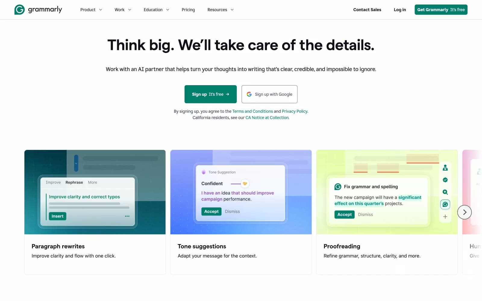
Grammarly design system

Brand1
Primary buttons, links, active nav, dark enterprise hero bands, decorative icon strokes — a deep botanical teal that reads as both professional and approachable against white and near-black surfaces
Neutrals11
Display headings, high-emphasis body text, link text — slightly cooler/deeper than Midnight Navy, used for the heaviest type
Dark surface fills for footer or alternate bands — warmer than Ink Black
Headings, navigation text, body copy, card text, icon strokes, footer copy — the dominant dark color carrying nearly all prose
Muted body text, secondary button labels, helper copy, icon strokes
Button hover states, secondary icon tinting, muted UI chrome
Tertiary text, disabled labels, low-emphasis metadata
Disabled borders, placeholder icons, very low-emphasis strokes
Hairline borders, subtle dividers, input rest states
Lighter hairline borders, checkbox outlines, secondary dividers
Subtle surface backgrounds, hover washes, secondary panels
Primary page background, card surfaces, button text on teal
Try a pairing
Pick any two colors from the palette to check whether text stays readable on top.
Aa
Paper on Grammarly Teal
4.98 : 1 contrast
- Body textPasses AA 4.5
- Large textPasses AA 3
- StrictFails AAA 7























