
Grain. Frosted glass desk with a single green pen.
- SaaS
- Light theme
- 14 colors
- 2 typefaces
Grain's design system is a quiet, near-monochrome productivity canvas where a single confident green does all the talking. The interface behaves like a high-end workspace app: spacious white surfaces, hairline borders, and soft drop shadows create depth without weight, while Inter handles nearly all UI text with measured, slightly tightened tracking. Color is rationed — the vivid green appears only on the primary download action and as subtle background washes, never as decoration. Component density is comfortable but information-rich: cards feel like documents rather than buttons, and product screenshots float in the page with generous radius and minimal frame. The distinctive choice is using Poppins weight 600 for section display titles against an Inter body, creating a typographic contrast where the heading style shifts register from the rest of the page. Overall the system feels like a well-organized analyst's desk: precise, restrained, and engineered for serious work.
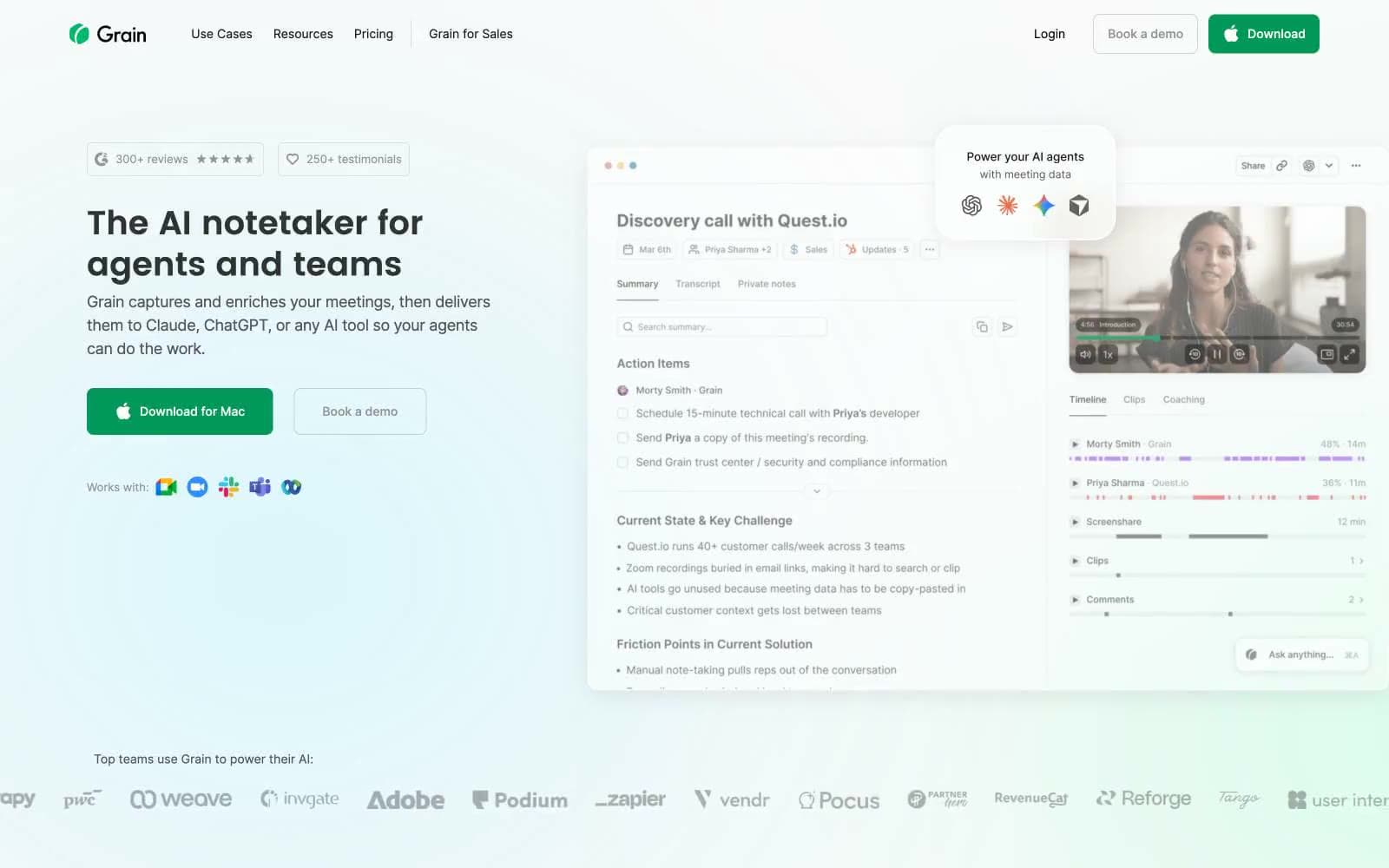
Grain design system

Brand2
Primary action — filled download buttons, outlined CTAs, and active nav indicators carry this deep botanical green that reads as decisive without aggression
Soft surface accent and gradient wash for feature sections — the mid-tone green that fades into the white canvas as ambient atmosphere
Accent2
Decorative illustration fill and gradient endpoint — appears only inside brand graphics, never on UI controls
Decorative illustration fill for brand mark and app icon glyphs — companion to Neon Sprout in the visual identity
Neutrals10
Primary text, heavy borders, and the dominant hairline divider color throughout the layout
Headline text and dark surface text — near-black with slight warmth for large display type
Secondary text, image overlays, and dark UI text on light backgrounds — the workhorse body tone
Body text helper copy and tertiary borders
Muted body text and subtle border tone for de-emphasized content
Icon strokes, placeholder text, and low-priority text color
Button borders and faint dividers — barely-there structural lines
Button background tint and elevated surface base
Hover states, tag backgrounds, and section background tint — the next surface above the canvas
Page canvas and card surfaces — the dominant background that everything floats on
Try a pairing
Pick any two colors from the palette to check whether text stays readable on top.
Aa
Obsidian on Forest Ink
5.70 : 1 contrast
- Body textPasses AA 4.5
- Large textPasses AA 3
- StrictFails AAA 7























