
Glitch Blog. Neon zine on white paper.
- SaaS
- Light theme
- 5 colors
- 1 typeface
Glitch Blog reads as a digital zine: white paper canvas, confident sans-serif type, and almost no UI chrome between the reader and the work. The signature choice is a single electric magenta (#ff00bc) that appears sparingly — in the logo mark, link underlines, and the 'All Stories' call — giving the page a spark of personality without ever overwhelming the editorial content. Blog cards are stripped to essentials: a wide image, a small date meta line, and a medium-weight title — no shadows, no borders, no tag pills. The visual system trusts that the artwork in each post carries the page, so the interface recedes. Density is comfortable with generous 20px gaps and 48px section spacing, creating a magazine-like reading rhythm rather than a dashboard grid.
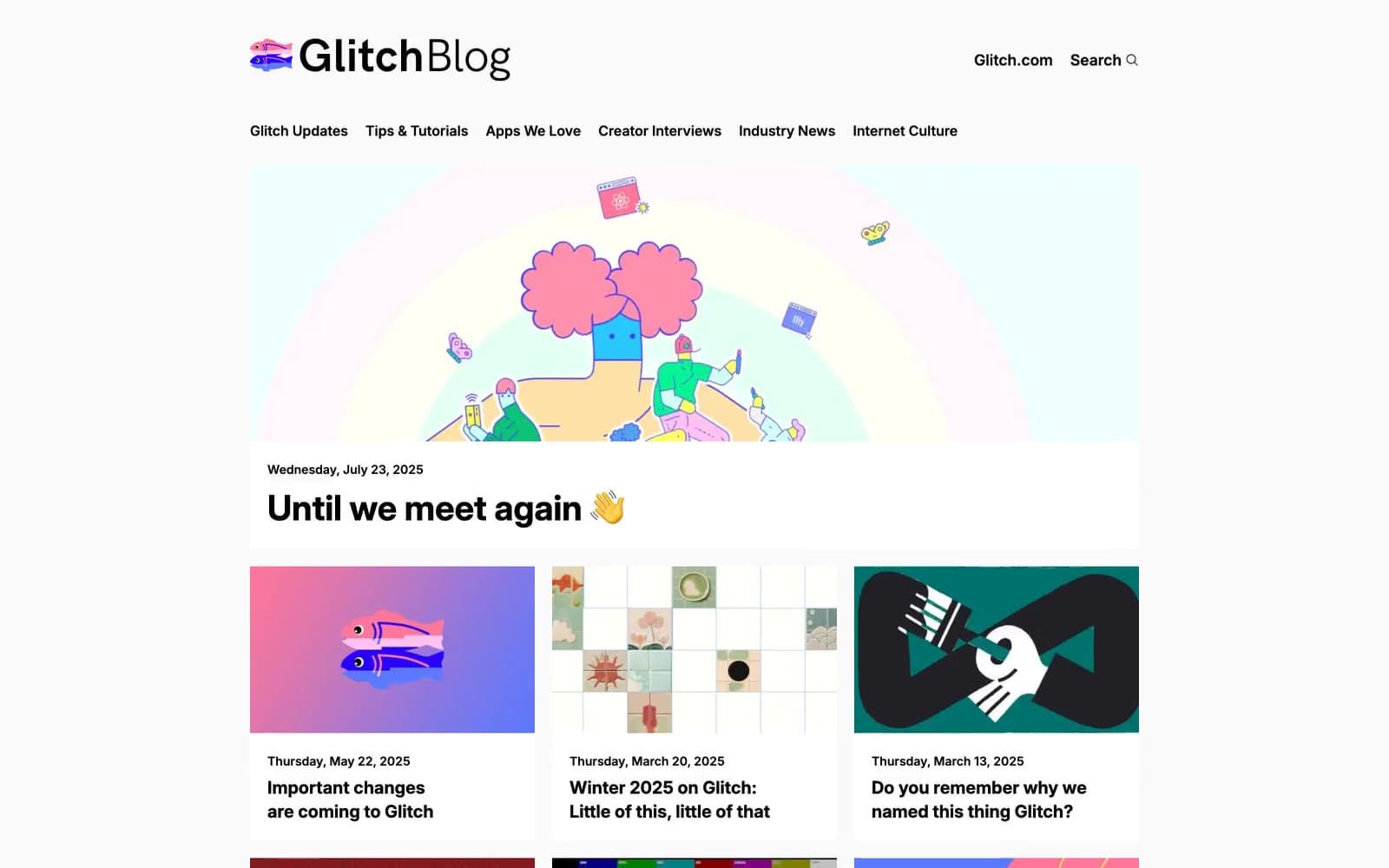
Glitch Blog design system

Brand1
Pink accent for outlined action borders, linked labels, and lightweight interactive emphasis. Do not promote it to the primary CTA color
Neutrals4
Body text, headings, nav links, border lines, icon strokes — the dominant structural color
Search input and form field borders
Footer divider border — barely-there separator
Page canvas, card surfaces, input fills — the base everything sits on
Try a pairing
Pick any two colors from the palette to check whether text stays readable on top.
Aa
Ink Black on Glitch Magenta
5.98 : 1 contrast
- Body textPasses AA 4.5
- Large textPasses AA 3
- StrictFails AAA 7























