
Getanchor. Warm terracotta on sun-bleached cream.
- SaaS
- Light theme
- 9 colors
- 1 typeface
Anchor's visual system reads as a warm editorial workspace: a sun-bleached cream canvas, one quiet terracotta accent, and type that feels set rather than styled. The dominant page surface is never pure white — it sits in the #f0e9e5 to #e3d7cd warm-cream range, which makes white product cards look lifted off the page like paper on paper. Color is rationed: roughly 99% of every screen is neutral, and the single warm orange (#ee884f) only fires on the primary action, earning attention by scarcity. Components stay flat and light — pill buttons, 4px-radius cards, hairline borders, and shadows so thin they read as paper grain rather than elevation. The tone is confident and unhurried, closer to a printed quarterly than a dashboard.
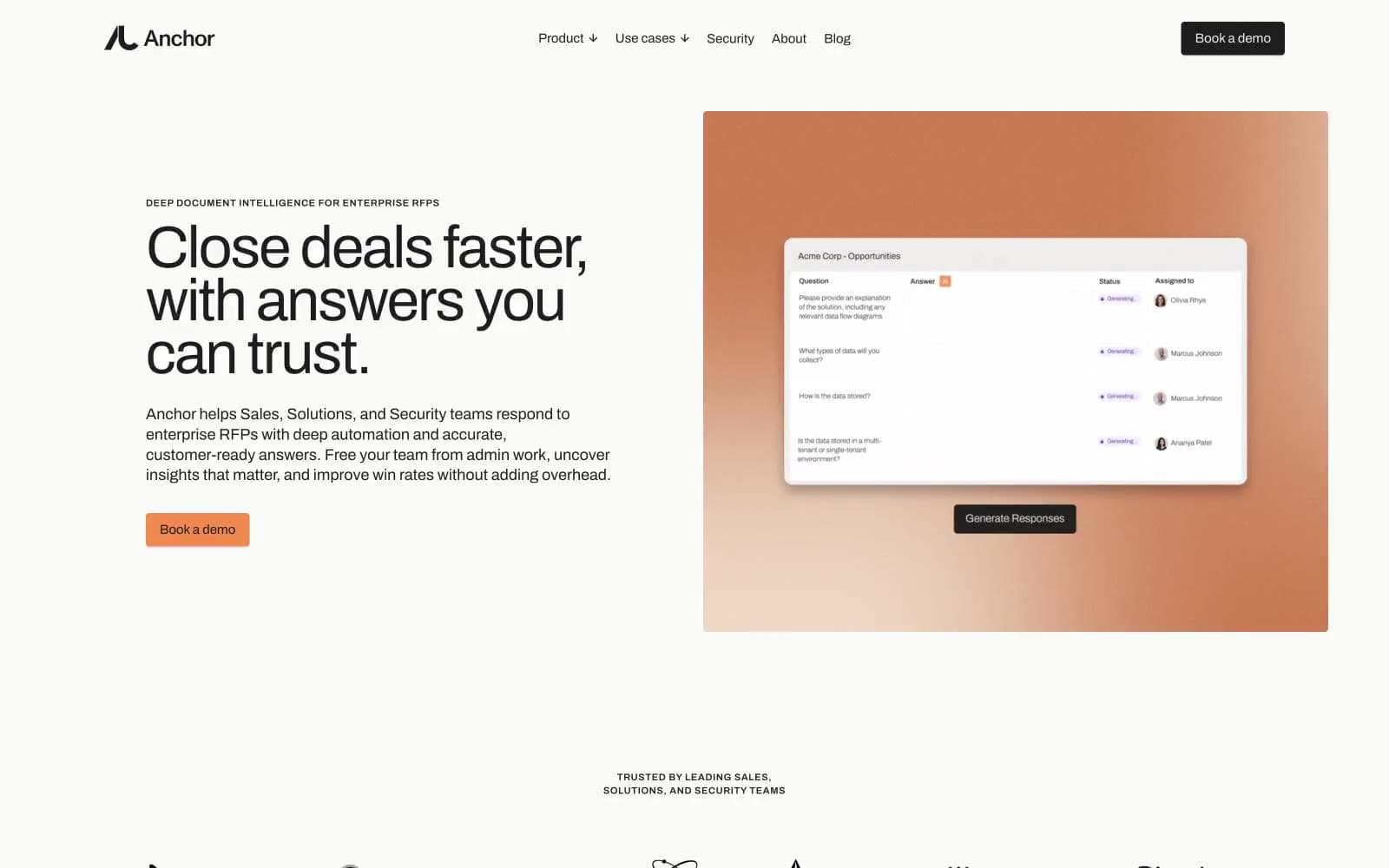
Getanchor design system

Brand1
Primary action button fill, the one chromatic accent — warm orange against cream creates urgency without aggression
Neutrals8
Pure black for SVG icon fills in dark contexts only
Body text, headings, primary borders, icon strokes — the dominant neutral that carries almost all type and structural lines
Secondary and helper text, muted labels, description copy
Subtle warm-gray dividers and disabled controls
Page background and deepest warm surface — the base tone of the entire site
Primary card and section surface, nav background, soft fills
Button hover surfaces and elevated neutral blocks, slightly cooler than Warm White
Top-level product card surfaces and modal panels that need to float above cream
Try a pairing
Pick any two colors from the palette to check whether text stays readable on top.
Aa
Charcoal on Terracotta
8.27 : 1 contrast
- Body textPasses AA 4.5
- Large textPasses AA 3
- StrictPasses AAA 7























