
Evergreen. Sunlit greenhouse on linen paper.
- SaaS
- Light theme
- 6 colors
- 3 typefaces
Evergreen uses a warm editorial language on a cream linen canvas, pairing a high-contrast didone-influenced serif for headlines with a friendly geometric sans for body. The palette is nearly monochrome — black ink, warm off-white surfaces, and a single soft sage mint used as organic highlight wash, never as decoration. The only saturated color is botanical and appears as a quiet accent inside avatars, badges, and illustrative leaves, never on buttons or large blocks. Components are rounded and tactile: pill-shaped primary buttons in pure black, 10px card radii, soft cream cards floating on the warmer page tone. Layout is centered and generous, with serif headlines large enough to dominate each section, body copy kept short and confident, and product/recognition mockups framed by hand-drawn leaf illustrations that bleed past their container edges.
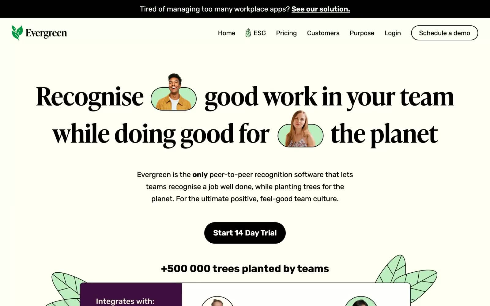
Evergreen design system

Accent1
Organic highlight wash for avatar backgrounds, tag pills, and the soft glow behind recognition cards — the only chromatic color, used like a botanical accent
Neutrals5
Primary action button fill, heading text, hairline borders, and the announcement bar — the high-contrast workhorse
Secondary text, icon strokes, and soft border definition where pure black would feel too heavy
Page background — the warm off-white base all sections sit on; this is the dominant surface of the entire site
Card and elevated surface background — slightly lighter than the canvas so cards read as lifted paper without shadow
Reserved for inverted text on dark buttons, product mockup surfaces, and high-contrast inline elements
Try a pairing
Pick any two colors from the palette to check whether text stays readable on top.
Aa
Ink Black on Sage Mint
16.06 : 1 contrast
- Body textPasses AA 4.5
- Large textPasses AA 3
- StrictPasses AAA 7























