
Employment Hero. Violet ink on white parchment.
- SaaS
- Light theme
- 15 colors
- 3 typefaces
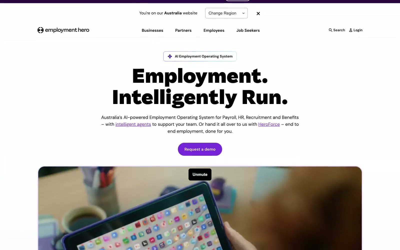
Employment Hero projects a confident, AI-forward HR platform identity built on extreme typographic weight contrast: Saiga at 800–1000 weight delivers near-black display headlines that dominate white canvases, while DM Sans at 400–500 keeps interface text light and approachable. The visual system is anchored by a single vivid violet (#7622d7) that appears as compact filled pills, thin borders, and icon strokes — never as broad color washes — creating a 'punctuation' effect where color marks intent rather than fills space. Surfaces layer in three violet-tinted steps (#ffffff → #f9f5ff → #f0e6fa) giving the impression of a very pale lavender atmosphere without ever feeling decorative. Components are deliberately geometric: 32px pill buttons, 8–12px card corners, generous 16–24px padding, and 1px hairline borders over soft backgrounds — the result feels like a precise technical document that learned to wear soft clothing.
Employment Hero design system

Brand5
Primary action fills, active nav, link text, icon strokes, key borders — concentrated violet that signals interactivity and energy against the achromatic canvas
Soft section backgrounds, card fills, hover surfaces — barely-there violet tint that creates atmospheric depth without committing to color
Slightly stronger lavender for tagged surfaces, highlighted cards, badge backgrounds
Outlined action borders, soft decorative borders, glow/shadow tints — a mid-violet for quieter emphasis
Gradient stops for hero washes and decorative banners
Accent2
Accent surface for special callouts, limited-use highlight wash (badge spotlight or feature emphasis)
Green action color for filled buttons, selected navigation states, and focused conversion moments
Neutrals8
Primary headings, dominant body text, high-contrast borders, footer surfaces — the load-bearing neutral
Secondary headings, dark UI blocks, badge text on light fills
Input field text, subdued body text, card detail labels
Mid-tone icon strokes, secondary metadata, less prominent UI labels
Muted body text, helper text, placeholder text, tertiary labels
Input borders, disabled states, de-emphasized dividers
Hairline dividers, card borders, structural separators
Page canvas, card surfaces, button text on violet fills, input fields
Try a pairing
Pick any two colors from the palette to check whether text stays readable on top.
Aa
Paper on Hero Violet
7.05 : 1 contrast
- Body textPasses AA 4.5
- Large textPasses AA 3
- StrictPasses AAA 7























