
Duolingo. Green playground with thick marker outlines.
- SaaS
- Light theme
- 11 colors
- 2 typefaces
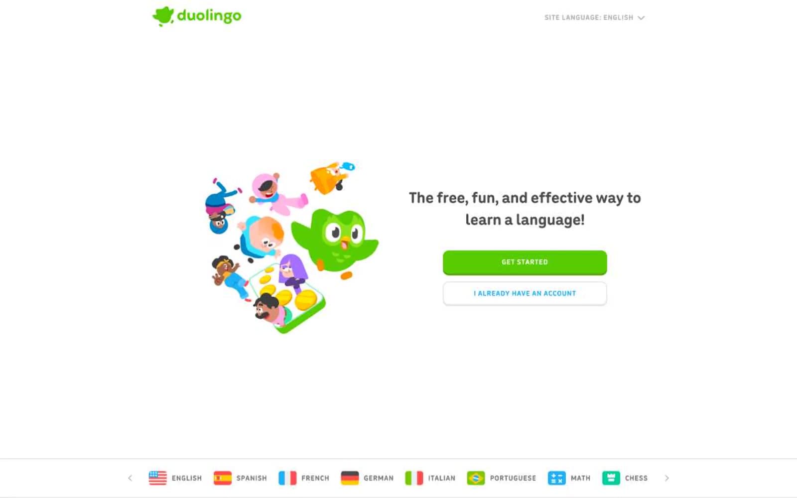
Duolingo is a playful, gamified language-learning canvas: a white background dominated by a single saturated brand green that fills primary actions, with thick, colorful borders giving every interactive element a tactile, pressable quality. The interface pairs a friendly rounded sans-serif for body, nav, and links with a heavy display face for oversized feature headlines, creating a contrast between approachable daily-use type and confident, exclamation-point section headers. Color appears sparingly but decisively — green for primary actions and headings, blue for secondary highlights, and a lighter lime green used extensively as a link/button border for an outlined, glowing treatment. The visual mood is warm, educational, and game-like, with cartoon character illustrations that humanize every product surface.
Duolingo design system

Brand3
Green outline accent for tags, dividers, and focused UI edges. Do not promote it to the primary CTA color
Outlined-action border and link accent — used as the chromatic border on link and button elements in 256+ instances. The lighter green outline gives interactive elements a glowing, highlighter-pen quality against white backgrounds
Soft highlight and pale border — lightest green used for card outlines, soft surface washes, and the bottom shadow border on filled green buttons to create a 3D pressable effect
Accent3
Secondary action accent — body borders, link text, and outlined button borders for secondary actions like language-specific CTAs. The cyan-blue sibling to the green system, signaling alternative or complementary actions
Deep heading text and border — navy blue used for emphasis headings and key border treatments, providing weight and contrast without competing with the green primary
Dark surface and button text — near-black violet used for dark-surface sections and as button label text on green fills
Neutrals5
Pure black for SVG illustration fills and maximum-contrast text where needed
Dominant neutral border — the workhorse gray used for hundreds of list and card borders throughout navigation, lists, and structural dividers. Not a background, a border system
Body text and icon borders — darker gray for body copy and icon outlines, sitting between the lighter Ash and the darker structural Graphite
Secondary text and nav borders — medium gray for navigation chrome, secondary text labels, and subtle structural borders
Page and card surface — the white canvas on which all content sits. Also used as text on dark surfaces and as border color for ghost buttons
Try a pairing
Pick any two colors from the palette to check whether text stays readable on top.
Aa
Ink on Ecto Green
10.05 : 1 contrast
- Body textPasses AA 4.5
- Large textPasses AA 3
- StrictPasses AAA 7























