
Dub Links. Warm sunrise over monochrome architecture.
- SaaS
- Light theme
- 17 colors
- 3 typefaces
Dub presents a warm, confident SaaS aesthetic: a near-monochrome interface anchored by soft cream-to-white gradients, with one vivid orange accent that makes every action feel activated. The system breathes through generous whitespace on a compact 4px grid, pairing Inter's utility precision with Satoshi's rounded display character for headlines. Surfaces stay matte and light with hairline borders and whisper-soft shadows — depth comes from subtle tonal shifts and elevation, never heavy panels. The primary CTA is always a black pill with orange-ember micro-accents nearby, creating a contrast between structural neutrality and brand warmth. Components should feel quick and utilitarian: 4px and 8px radii dominate, pill buttons carry CTAs, and cards are flat white rectangles on a faintly warm canvas.
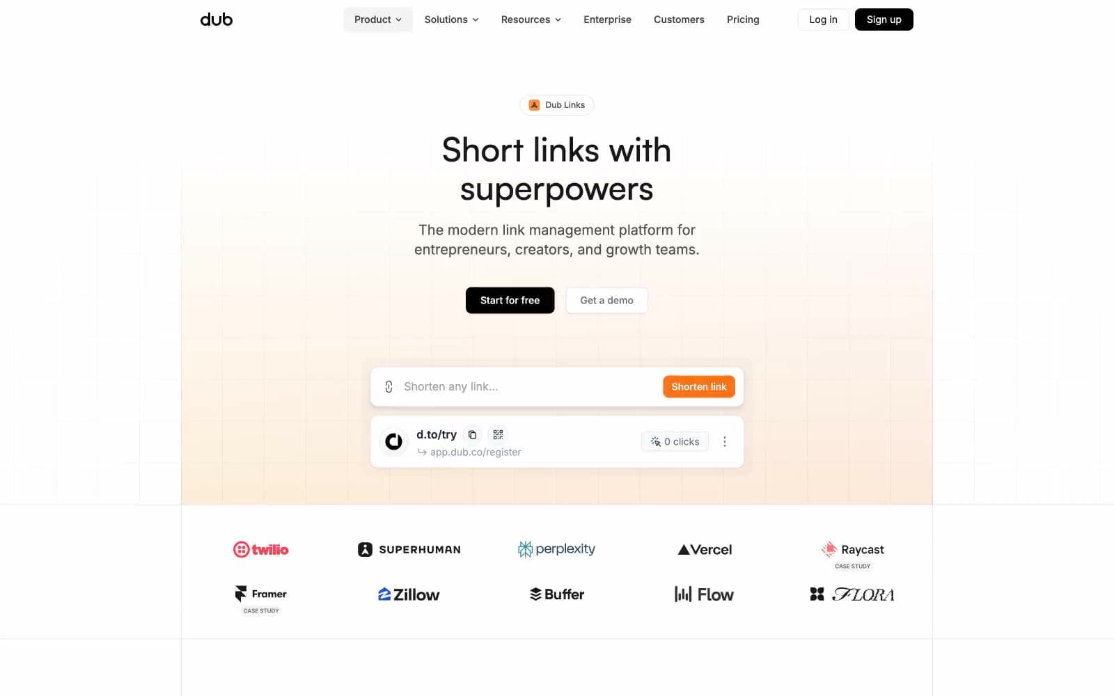
Dub Links design system

Brand4
Orange supporting accent for decorative details and low-frequency emphasis. Do not promote it to the primary CTA color
Lighter orange for hover states on ember elements, soft accent fills
Dark orange for icon strokes and decorative accents needing depth
Gradient endpoint for the hero's warm peach wash — the signature atmospheric gradient
Accent3
Decorative icon accent, link highlights, informational touches — the secondary chromatic note
Green supporting accent for decorative details and low-frequency emphasis. Use as a supporting accent, not as a status color
Red supporting accent for decorative details and low-frequency emphasis. Use as a supporting accent, not as a status color
Neutrals10
Dark supporting neutral for text, icons, and strong contrast. Do not promote it to the primary CTA color
Secondary text, button text on dark fills, heading weights
Tertiary text, muted descriptions, secondary button text
Muted body text, secondary icon strokes, meta information
Placeholder text, disabled states, low-emphasis body copy
Icon fills at rest, muted helper text, tertiary icons
Input borders at rest, subtle dividers, inactive form controls
Hairline borders throughout — the workhorse divider color
Page background base — the warm off-white that gives the interface its sunlit feel
Card surfaces, elevated panels, input fields — pure white for content containers
Try a pairing
Pick any two colors from the palette to check whether text stays readable on top.
Aa
Ink Black on Ember Orange
5.56 : 1 contrast
- Body textPasses AA 4.5
- Large textPasses AA 3
- StrictFails AAA 7























