
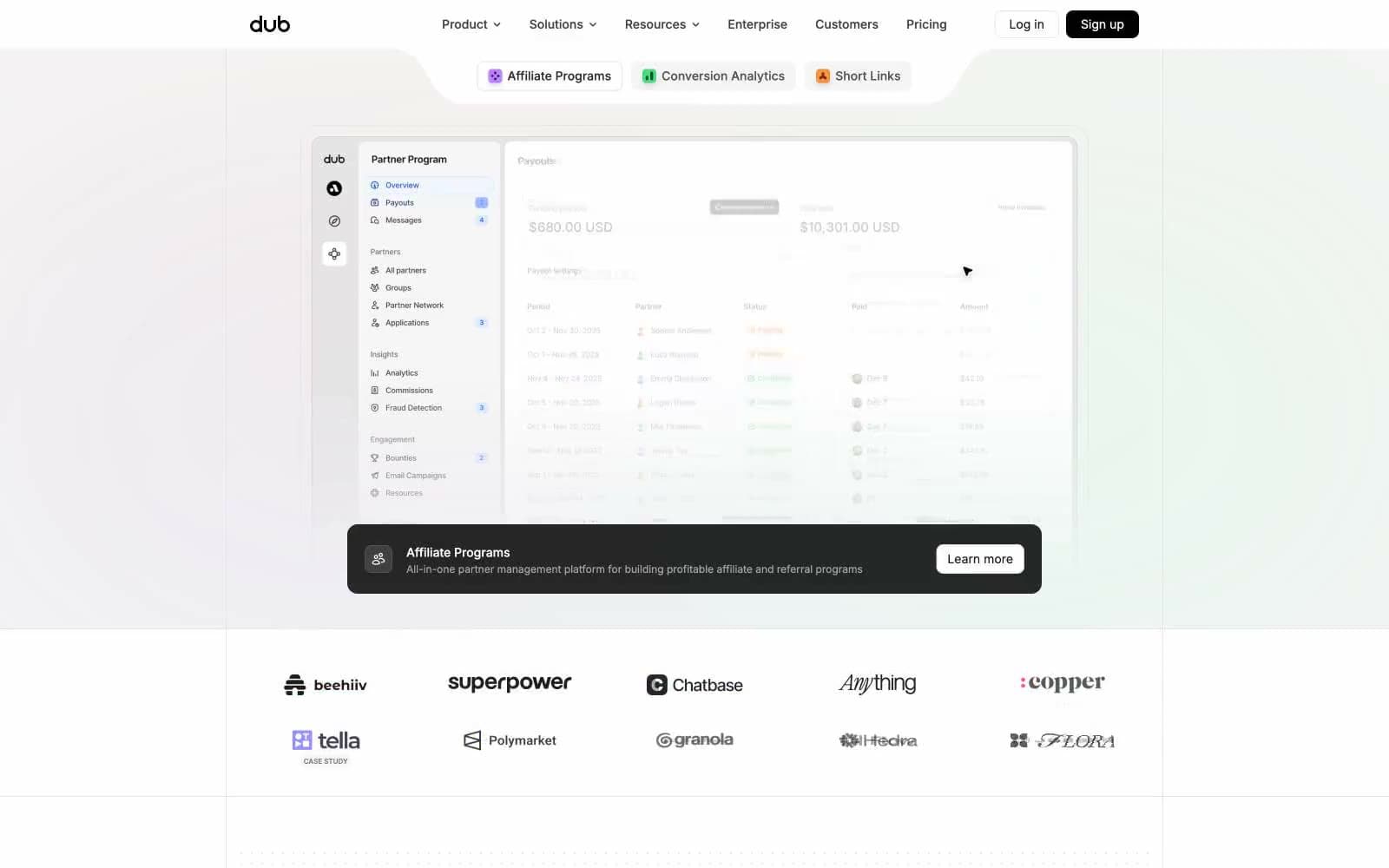
Dub. Frosted link dashboard on rice paper.
- SaaS
- Light theme
- 20 colors
- 3 typefaces
Dub's visual system is a quiet, almost editorial SaaS aesthetic — a near-white canvas held together by hairline borders rather than elevation, with dense monochrome typography doing the structural work and one electric blue (#2563eb) doing the talking. Surfaces stay flat and borderless-looking at a glance, but every container carries a 1px #e5e5e5 edge that creates a printed-document feel. The personality comes from a small vocabulary of colored 'feature pill' accents (orange, green, violet) that float above the otherwise neutral palette, and from Satoshi-weight-500 display headlines that read as confident and contemporary without being loud. Components are compact and dense: 8px gaps, 12px card radius, pill-shaped tags at 9999px, and ghost controls instead of heavy filled buttons.
Dub design system

Brand2
Primary brand color — logo, links, key metric highlights, active states, icon accents. Saturated blue against white gives the system its one moment of visual voltage
Primary action button background, high-emphasis CTA fill — the single committed action color, used sparingly so it earns attention
Accent5
Gray outline accent for tags, dividers, and focused UI edges. Use as a supporting accent, not as a status color
Green text accent for links, tags, and emphasized short phrases. Use as a supporting accent, not as a status color
Orange text accent for links, tags, and emphasized short phrases.
Violet text accent for links, tags, and emphasized short phrases.
Decorative gradient — used as full-spectrum conic gradient on brand visuals and logo, never on UI elements
Neutrals13
High-contrast neutral action fill for primary buttons on light surfaces. Use as the primary filled action background
Primary button text, high-emphasis buttons, nav text — near-black for maximum contrast
Body text, button text, default heading color — slightly softer than pure black
Secondary text, icon strokes, subtle UI elements
Tertiary text, nav hover states, subdued iconography
Muted body text, helper text, less-prominent labels
Placeholder text, disabled states, link text in rest state
Disabled iconography, decorative strokes, very light dividers
Medium-contrast borders, control outlines, and structural separators. Do not promote it to the primary CTA color
Stronger borders for emphasis containers and secondary button outlines
Hairline borders on cards, inputs, and dividers — the structural line that holds the system together
Subtle alt-surface for nested cards, secondary panels, and hover fills
Page background, card surfaces, popover panels — the absolute base of every screen
Try a pairing
Pick any two colors from the palette to check whether text stays readable on top.
Aa
Canvas White on Electric Blue
5.17 : 1 contrast
- Body textPasses AA 4.5
- Large textPasses AA 3
- StrictFails AAA 7























