
Dropbox.com. Editorial confidence on paper.
- SaaS
- Light theme
- 7 colors
- 5 typefaces
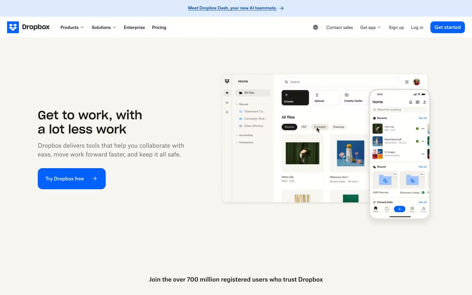
Dropbox reads as a warm editorial workspace rather than a cold productivity dashboard. The canvas is cream paper (#f7f5f2), not sterile white; text is a warm near-black (#1e1919), not pure ink. The brand speaks through one confident electric blue (#0061fe) that paints every action surface, paired with Sharp Grotesk headlines and Atlas Grotesk body copy — a custom Grotesk pairing that gives the system a proprietary, designed quality. Layouts are generous and breathing, built on a 6px base, with 2-column card grids, split text+visual heroes, and minimal elevation. Surfaces are flat with hairline borders; corners are soft (8–16px). The mood is approachable, considered, and quietly confident — the opposite of a sterile enterprise UI.
Dropbox.com design system

Brand1
Violet supporting accent for decorative details and low-frequency emphasis. Do not promote it to the primary CTA color
Accent1
Decorative highlight, occasional link underline, brand illustration accent — provides chromatic variety without competing with primary blue
Neutrals5
Primary text, dark nav button text, heading color — warm near-black reads softer than pure ink on cream backgrounds
Secondary text, helper copy, muted icon strokes, footer metadata — warm desaturated gray that sits comfortably on cream
Alternate card surface, subtle elevated panel — slightly darker cream for cards that need gentle separation from canvas
Page canvas, section backgrounds, nav bar surface — warm off-white replaces sterile SaaS white to soften the system
Elevated card surfaces, content panels, product mockup backgrounds — the only true white, reserved for surfaces that sit on the cream canvas
Try a pairing
Pick any two colors from the palette to check whether text stays readable on top.
Aa
Pure White on Dropbox Blue
5.07 : 1 contrast
- Body textPasses AA 4.5
- Large textPasses AA 3
- StrictFails AAA 7























