
Ditto. Marked-up manuscript on warm parchment.
- SaaS
- Light theme
- 15 colors
- 3 typefaces
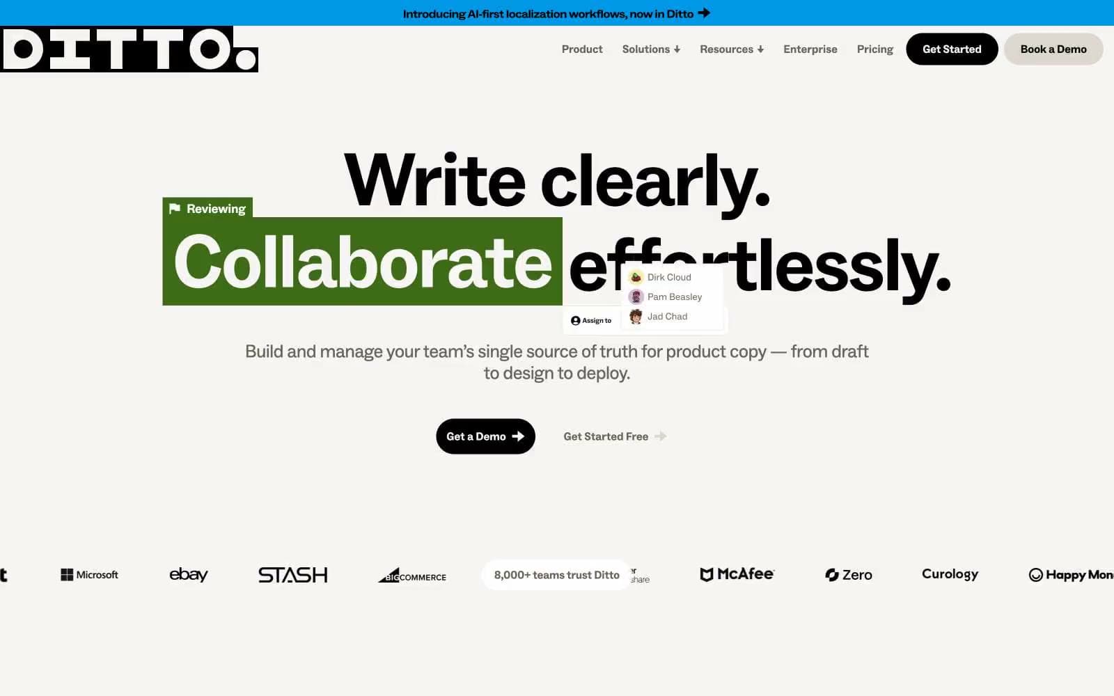
Ditto speaks the visual language of a copy editor's desk: warm parchment-cream canvases, confident black sans-serif type at near-poster scale, and a full crayon box of highlighter colors applied as if someone grabbed a marker. Every color in the palette is a tool — green, yellow, orange, purple, blue, pink all function as markup ink over running text, never as decorative fills. Components are stubby and rounded into pills — buttons, tags, and nav items all collapse into the same soft capsule shape, keeping the surface quiet so the annotated text can shout. There are no shadows, no gradients, no glassmorphism — the entire identity is built from flat color, heavy type, and the metaphor of someone reviewing a manuscript with a set of Sharpies.
Ditto design system

Accent6
Orange accent for outlined action borders, linked labels, and lightweight interactive emphasis
Pink accent for outlined action borders, linked labels, and lightweight interactive emphasis.
Blue accent for outlined action borders, linked labels, and lightweight interactive emphasis.
Soft pink annotation accent — used as a desaturated highlight wash where a more aggressive color would overpower the text underneath
Workflow stage active marker (the filled square in the Draft/Design/Review sidebar) and muted annotation accent — a brass tone that ages the system slightly
Vivid yellow-olive accent for highlighted text borders and decorative annotation ink — sits between Marker Yellow and Olive Gold in the annotation palette
Neutrals7
Primary text, heading color, nav text, button fills, and hairline borders — the heaviest presence in the system at 1,849 hits. High-contrast against Parchment (#f7f5f3) at 19.3:1
Secondary text and structural borders, softer than pure black for elements that need hierarchy without dropping out of the warm palette
Muted text, secondary nav labels, and border accents — a brown-tinted dark gray that keeps the system's warmth even in its quietest elements
The faintest warm neutral — used for stroke accents and very low-contrast section backgrounds
Subtle background lift and pill backgrounds on light elements where Parchment is too close to the canvas
Page canvas, section backgrounds, and the inside of cards — a warm off-white that reads as paper, not screen. Every other color in the system is applied as ink on top of this surface
Card surfaces that need to pop above Parchment, badge fills, and the base for inverse-on-color elements
semantic2
Green accent for outlined action borders, linked labels, and lightweight interactive emphasis.
Yellow state accent for badges, validation surfaces, and short status labels.
Try a pairing
Pick any two colors from the palette to check whether text stays readable on top.
Aa
India Ink on Edit Orange
7.02 : 1 contrast
- Body textPasses AA 4.5
- Large textPasses AA 3
- StrictPasses AAA 7























