
Cycle. Ink-stained porcelain workshop with jewel-toned labels.
- SaaS
- Light theme
- 26 colors
- 3 typefaces
Cycle's visual language reads as a warm, analog workspace — slightly off-white canvas, ink-black type, and a palette of deep jewel tones that feel more like vintage inkpots than SaaS accents. Headlines use Eudoxus Sans at heavy weights with tight tracking, giving every title physical weight; body and UI default to Inter at comfortable 14–16px. Components sit on a very soft shadow system (low-opacity warm gray) rather than hard borders, and large 20px corner radii make cards feel like ceramic tiles. Color is functional and categorical — each product agent or feature cluster gets its own deep hue (teal, violet, amber, maroon) and its own tinted background wash, never decorative gradients.
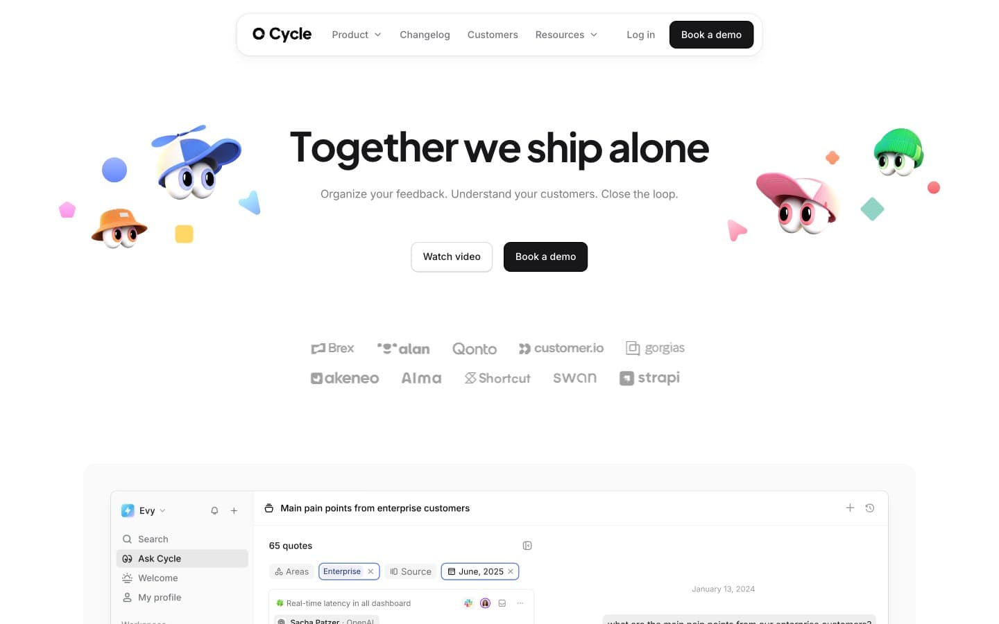
Cycle design system

Brand9
Product accent — Pathfinder agent, data-viz category, teal-tinted section backgrounds pair it
Product accent — VoiceHunter agent, primary feature category, violet wash sections
Product accent — LoopCloser agent, gold-tinted section backgrounds and warm callouts
Product accent — additional agent or feature category, paired with pinkish washes
Product accent — analytics or infrastructure category
Product accent — heading accent on warm-toned pages
Product accent — rust-toned category, icon and illustration accent
Product accent — dark variant of the violet for headings and iconography on light surfaces
Dark amber — heading text when a warm-tone treatment is needed; Yellow supporting accent for decorative details and low-frequency emphasis. Use as a supporting accent, not as a status color
Accent7
Soft tinted background — feature section panels, agent card backgrounds
Soft tinted background — teal-categorized section panels
Soft tinted background — gold-categorized section panels
Soft tinted background — warm secondary section panels
Badge and small-card background — violet category
Badge and small-card background — teal category
Gray supporting accent for decorative details and low-frequency emphasis. Use as a supporting accent, not as a status color
Neutrals10
Dark supporting neutral for text, icons, and strong contrast. Do not promote it to the primary CTA color
Primary text, icons, dark surfaces — the dominant neutral; never use pure #000 for text
Secondary text, nav links, muted body copy — the workhorse mid-gray
Badge text, metadata labels
Tertiary nav, breadcrumb separators
Subtle shadow tint, placeholder text in low-emphasis contexts
Button borders, disabled outlines
Hairline borders, input backgrounds, divider lines — the quietest structural neutral
Page background, subtle section divider — the off-white that gives the system its warm analog feel
Card surfaces, modal panels, text on dark buttons — the brightest surface in the stack
Try a pairing
Pick any two colors from the palette to check whether text stays readable on top.
Aa
Paper White on Deep Teal
9.42 : 1 contrast
- Body textPasses AA 4.5
- Large textPasses AA 3
- StrictPasses AAA 7























