
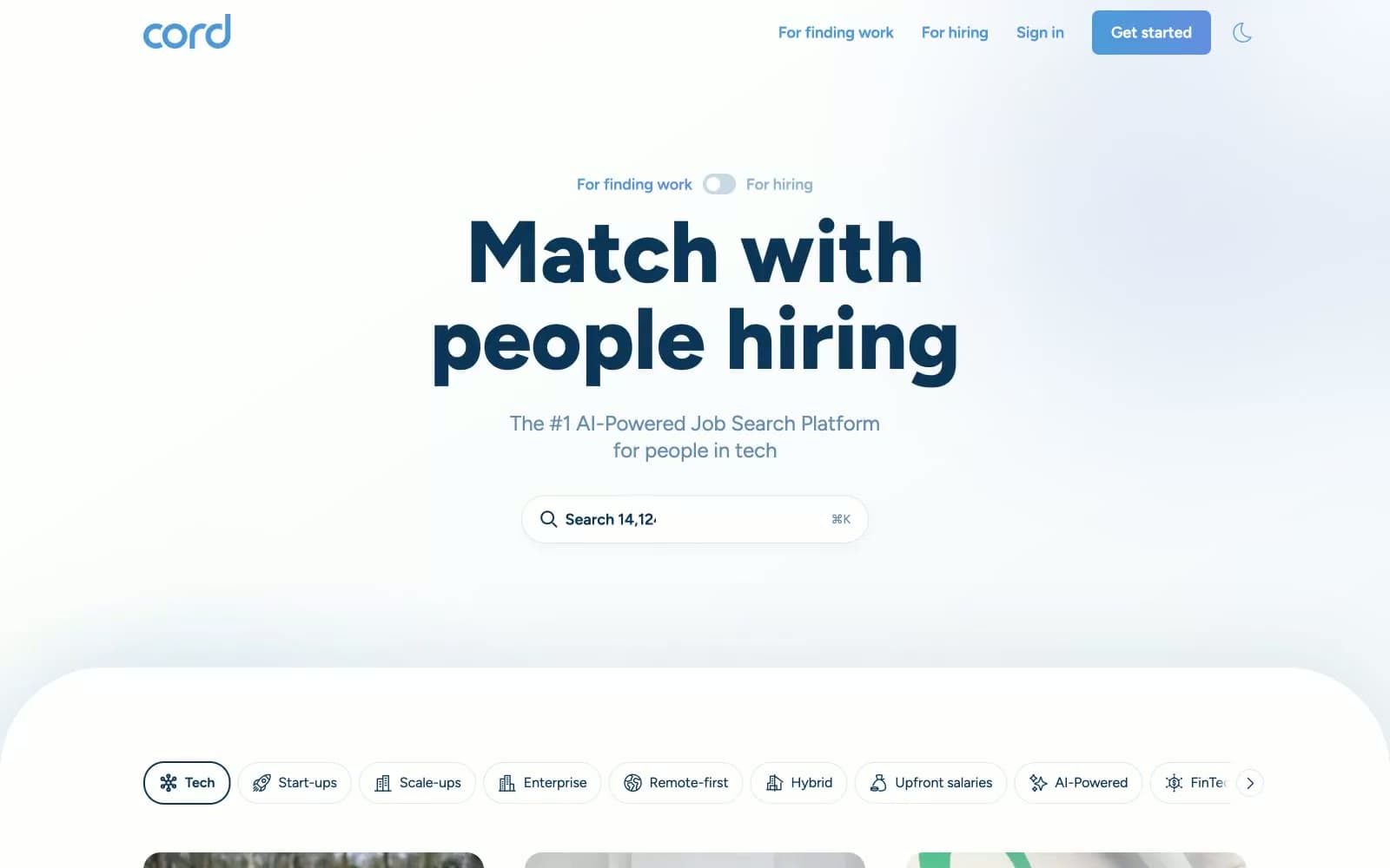
cord.com. A deep-navy command deck set against white sea-fog, punctuated by one bright blue flare.
- SaaS
- Light theme
- 9 colors
- 1 typeface
Cord uses a maritime-monochrome language: an almost white canvas flooded with generous air, a near-black midnight navy (#0b3658) carrying every word of weight, and a single bright harbor-blue accent (#4e9ad9) reserved for the logo, the primary button, and active states. The type system rides one family (Figtree) from weight 400 body up to weight 800 display, producing headlines that feel stamped rather than set. Surfaces are soft and rounded — cards float on tinted-blue shadows rather than hard borders, with corner radii between 20px and 32px that make the product feel approachable despite the serious navy palette. Rhythm is calm and centered: one dominant headline, one subtitle, one search field, no chrome — the UI reads like a job board stripped to its essentials and then lightly polished. The only chromatic deviation outside the navy/blue axis is a green presence indicator (#42b3b1) and a single dark CTA banner that flips to the navy ground color, creating the page's one moment of contrast.
cord.com design system

Brand2
Primary text, headings, logo, dark CTA banner — the near-black navy that carries the entire voice of the interface
Primary action background, logo wordmark, active nav and toggle states — the single bright chromatic accent against the navy/white axis
Accent1
Teal outline accent for tags, dividers, and focused UI edges
Neutrals6
Secondary text, outlined link borders, muted icon strokes — mid-tone companion to Midnight Harbor for de-emphasized copy
Tertiary text and meta labels, light borders on headings — the lightest blue-gray still reading as chromatic
Disabled or secondary button fill, neutral surface accent — the warm-cool border between Ice Tint and Sea Fog
Card borders, image borders, link underlines, hairline dividers — the dominant neutral stroke color
Subtle background washes, hover surfaces, tinted input backgrounds — barely-there blue for grouping without weight
Page background, card surface, button text — the dominant canvas that every other color sits on
Try a pairing
Pick any two colors from the palette to check whether text stays readable on top.
Aa
Canvas White on Midnight Harbor
12.48 : 1 contrast
- Body textPasses AA 4.5
- Large textPasses AA 3
- StrictPasses AAA 7























