
Clutch Security. Typography museum on white marble.
- SaaS
- Light theme
- 11 colors
- 3 typefaces
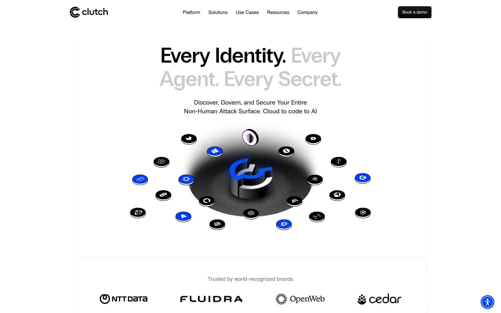
Clutch Security operates in a gallery-white minimalism: a bright, almost paper-like canvas where typography carries the entire visual weight and a single electric blue does all the chromatic talking. The signature typographic move is PP Radio Grotesk display headlines where key words shift between weight 400 and 600 within the same sentence, creating a call-and-response rhythm that feels like a conversation rather than a declaration. The interface is nearly flat — 6px corners, hairline 1px borders in cool gray, and no decorative shadows — so the occasional 3D orbital illustration or 3D brand mark feels like a found object on a clean table. Everything is centered, spacious, and confident; the 80px section breaks and generous internal padding give each element room to assert itself without competing.
Clutch Security design system

Brand2
Primary action buttons, active states, the single chromatic accent that punctuates the entire monochrome system
Light blue surface for highlighted regions, subtle brand-tinted backgrounds, soft accent fills
Accent1
Soft violet surface for the brand mark and tertiary accent zones, a whisper of warmth against the cool palette
Neutrals8
Neutral form states, badge text, and quiet UI feedback where color should stay understated. Do not promote it to the primary CTA color
Secondary text, link color, muted descriptions, supportive copy that recedes from primary content
Tertiary surface fills, disabled-state backgrounds, very subtle card differentiation
Drop shadow base at 16% opacity, secondary dividers, barely-there surface separation
Secondary borders, card edges, input field outlines, the structural grid color at 1px weight
Primary hairline borders, the most-used divider color, separating cards, sections, and table rows
Subtle page-surface lift, alternating section backgrounds, the barely-warm off-white that breaks pure white monotony
Page background, card surfaces, text on dark fills, the dominant surface where everything sits
Try a pairing
Pick any two colors from the palette to check whether text stays readable on top.
Aa
Canvas on Electric Cobalt
5.99 : 1 contrast
- Body textPasses AA 4.5
- Large textPasses AA 3
- StrictFails AAA 7























