
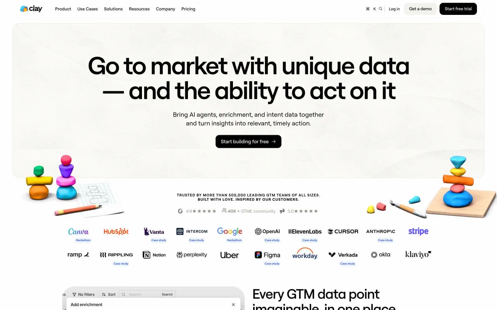
Clay. Bright playroom of clay shapes on white paper.
- SaaS
- Light theme
- 19 colors
- 3 typefaces
Clay uses a bright, tactile workspace language: white canvas with weighty black type, pill-shaped controls, and a vivid violet accent (#3859f9) that powers links, key callouts, and inline emphasis. Most surfaces stay monochrome — warm cream (#f9f8f6) cards on pure white with soft beige borders (#dad4c8) — while chromatic moments arrive as full-bleed colored testimonial cards in lime, orange, cyan, and magenta, like individual clay sculptures placed on a clean table. Components feel hand-shaped rather than pixel-perfect: generous border radii (12–40px), near-zero elevation, and tight negative tracking on large display sizes. The overall feel is energetic and confident without being decorative — color is reserved for social proof and brand moments, not for functional UI.
Clay design system

Brand3
Brand accent for inline links, highlighted keywords, and key emphasis text — the only saturated color that runs through body and heading copy
Top announcement bar background — soft violet band reserved for event/promo strips
Logo 'c' glyph and small brand insignia accents
Accent8
Vivid card background for testimonial panels and social proof blocks
Vivid card background for testimonial and social proof blocks
Vivid card background for testimonial blocks and feature callouts
Vivid card background for testimonial blocks and product feature surfaces
Deep vivid blue card background — used in social proof carousel for darker contrast moments
Saturated card background for testimonial blocks — rare but present in the color carousel
Saturated card background for testimonial blocks and feature highlights
Soft pink card background — the only pastel in the accent set, used sparingly for tonal variety
Neutrals8
Dark supporting neutral for text, icons, and strong contrast. Do not promote it to the primary CTA color
Near-black for nav text, button labels, and high-contrast UI text
Body text, muted paragraphs, and secondary link color — warm dark gray for readable supporting copy
Tertiary text, icon strokes, and low-emphasis labels
Primary hairline border and divider — warm beige rather than cool gray, keeps the system from feeling sterile
Secondary cool-tone border for inputs, structural dividers, and subtle UI frames
Soft surface variant for feature cards, footer background, and off-white panels — gives the white space a paper-like warmth
Page canvas, card surfaces, button text on dark fills, inverted text on color
Try a pairing
Pick any two colors from the palette to check whether text stays readable on top.
Aa
Paper White on Violet Pulse
5.30 : 1 contrast
- Body textPasses AA 4.5
- Large textPasses AA 3
- StrictFails AAA 7























