
Chronicle. A composited page where precision of letterform carries the entire visual weight, color is an intrusion, and the grid is the design.
- SaaS
- Light theme
- 11 colors
- 1 typeface
Chronicle runs on a strict achromatic foundation: white canvas, near-black ink, and a structured gray scale — no brand color, no decorative hue, zero saturation. The product UI (rendered in electric blue inside presentation previews) is the only color that appears on the page, framed as content rather than interface chrome. Typography is a single custom variable font, Diatype, at tight negative tracking — headlines compress letterforms so aggressively at large sizes that the text feels mechanically engraved rather than set. Buttons are either filled black or ghost-outlined, both with hairline 4px radius corners, keeping the interface sharp and editorial rather than app-friendly. The overall rhythm is generous white space punctuated by 1px borders and one subtle card shadow, with sections separated by alternating white and warm-gray (#f3f3f3) bands.
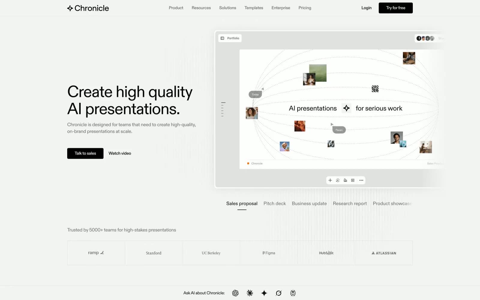
Chronicle design system

Neutrals11
Filled action button backgrounds (Try Chronicle, Talk to sales, Try for free); icon fills; strongest contrast anchor
Dark borders and separators for elevated surfaces and inverted UI. Do not promote it to the primary CTA color
Navigation link text and active nav states
Footer fine print and copyright text
Body text, UI borders, ghost button borders and text — the workhorse mid-tone
Secondary body copy and captions
Disabled or inactive button text and borders
Subtle background dividers and muted separators
Card borders, image borders, input borders — the hairline rule color
Alternating section backgrounds, testimonial section canvas, muted surface fills
Primary page canvas, card surfaces, link text on filled black buttons
Try a pairing
Pick any two colors from the palette to check whether text stays readable on top.
Aa
Cloud on Midnight
21.00 : 1 contrast
- Body textPasses AA 4.5
- Large textPasses AA 3
- StrictPasses AAA 7























