
Carrot. Confident, flat, and slightly loud.
- SaaS
- Light theme
- 4 colors
- 2 typefaces
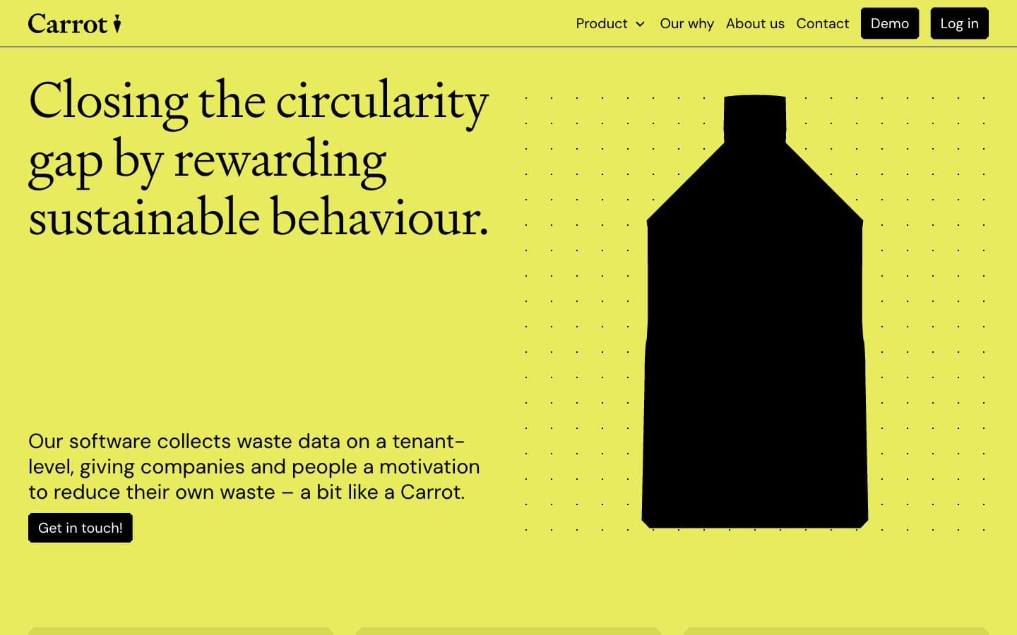
Carrot commits to a radical single-color canvas — an electric chartreuse field that saturates the entire page and makes the brand impossible to misread. The rest of the system is deliberately stripped: black ink for type and structural elements, white for surfaces and button text, and a dark olive reserved for quiet secondary marks. Typography draws a sharp line between editorial and functional — a light-weight custom serif (Signifier at 300) carries the hero voice while DM Sans handles everything utilitarian at conversational weights. The result reads like a printed sustainability manifesto rendered as a web product: confident color, generous breathing room, zero ornament, and an almost rebellious refusal to use shadows, gradients, or rounded softness.
Carrot design system

Brand1
Full-page canvas and dominant brand surface — the chartreuse wash that defines the entire product. Used as hero background, section backgrounds, and feature card backgrounds with no variation or gradient
Accent1
Quiet secondary accent for subdued text or border moments where pure black would feel too heavy. Rarely used — the chartreuse does the color work
Neutrals2
Primary type, filled CTA buttons, icon strokes, borders, and graphic silhouettes (the bottle hero). The structural ink of the system
Text on black buttons, product screenshot card backgrounds, and any inverted surfaces. Pure white — not off-white
Try a pairing
Pick any two colors from the palette to check whether text stays readable on top.
Aa
Carbon Black on Citrus Field
14.56 : 1 contrast
- Body textPasses AA 4.5
- Large textPasses AA 3
- StrictPasses AAA 7























