
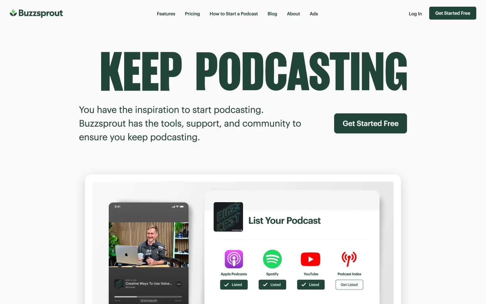
Buzzsprout. A forest-green command console on white paper, anchored by a massive condensed-serif headline that reads like a magazine cover for audio.
- SaaS
- Light theme
- 10 colors
- 2 typefaces
Buzzsprout's design language is a quiet, editorial command center for audio creators: a white canvas overlaid with a single deep botanical green (#214538) that carries every brand action and headline. The interface is deliberately sparse, leaning on generous whitespace, hairline #e4e5e6 borders, and soft 8px radii to build a sense of calm professionalism. Typography is the signature element — a condensed serif display face (Girott) shouting at 168px sits against the practical geometric sans (Graphik) handling everything else, creating a magazine-meets-dashboard tension. Color is used as punctuation, not decoration: green appears only on CTAs, active states, brand marks, and key links, while body text stays in a near-black green-tinted ink (#151e1b) and helper copy drops to #4d4d4f. The rhythm alternates between bright white product sections and a single dark photographic band, giving the page a focused, almost meditative feel rather than a marketing-firehose energy.
Buzzsprout design system

Brand1
Primary brand action — CTA button fills, nav text, active tab indicators, brand icons, link hovers, section headings. Deep botanical green against white gives every action weight without aggression
Accent2
Yellow wash for highlight backgrounds, decorative bands, and soft emphasis behind content.
Green text accent for links, tags, and emphasized short phrases. Do not promote it to the primary CTA color
Neutrals7
Icon fills and select heading text where maximum contrast is needed. Used sparingly — mostly for decorative SVG icon weight
Primary body and heading text. Slightly green-tinted near-black reads as quieter than pure #000, harmonizing with the brand green instead of fighting it
Secondary and helper text — descriptions, captions, supporting copy under headings and feature labels
Default hairline border for cards, inputs, nav containers, list dividers, and button outlines. The structural skeleton of the interface
Soft green-tinted card surface — used for stat cards and feature tiles where a faint brand color cue is needed without commitment to a filled green block
Subtle background for tab buttons, list rows, and secondary button borders. One step darker than white to delineate zones without elevation
Page canvas, card surfaces, button text on dark green fills, icon knockouts. The dominant background across the entire site
Try a pairing
Pick any two colors from the palette to check whether text stays readable on top.
Aa
Paper White on Forest Canopy
10.64 : 1 contrast
- Body textPasses AA 4.5
- Large textPasses AA 3
- StrictPasses AAA 7























