
Buymeacoffee. Cream-paper café scrapbook with floating polaroid testimonials.
- SaaS
- Light theme
- 10 colors
- 5 typefaces
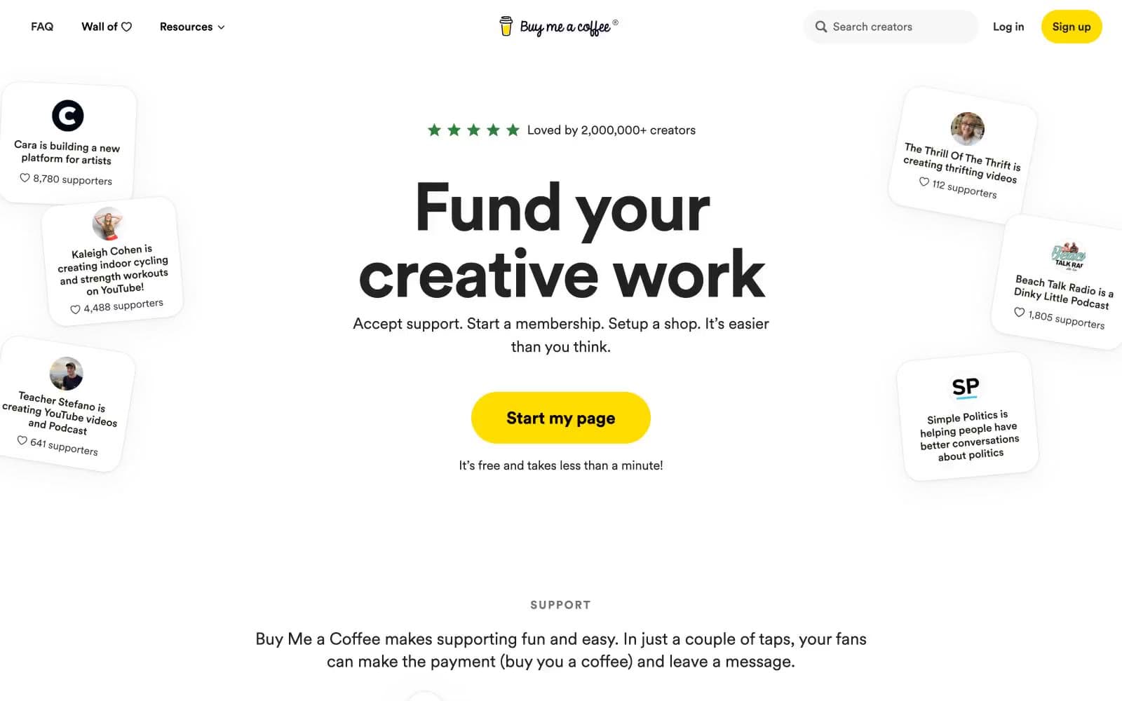
Buy Me a Coffee operates on a warm, generous canvas — a cream paper background (#faf8f0) that softens the entire experience like sunlight through a café window. The interface is overwhelmingly monochromatic with black text at heroic sizes (96px display), reserving color for two highly intentional roles: a bright marigold yellow (#ffdd00) for creator-facing signup actions, and a burnt terracotta (#d8573f) for supporter-facing payment actions. Cards float with generous 24-40px radii and soft layered shadows that feel like paper resting on a table. The Circular font family gives everything a friendly, geometric warmth — bold weights carry massive headlines with tight tracking while lighter weights handle conversational body copy. The system breathes: wide margins, floating creator cards, pill-shaped buttons, and small-caps section labels that whisper rather than shout.
Buymeacoffee design system

Brand3
Yellow wash for highlight backgrounds, decorative bands, and soft emphasis behind content. Do not promote it to the primary CTA color
Yellow wash for highlight backgrounds, decorative bands, and soft emphasis behind content. Do not promote it to the primary CTA color
Orange outline accent for tags, dividers, and focused UI edges. Do not promote it to the primary CTA color
Accent1
Soft warm border accent for notification cards and supporter activity popovers — bridges Terracotta's intensity into a gentle outline
Neutrals6
Primary text, filled icon strokes, high-contrast UI elements — the dominant text and icon color across the entire product
Body and heading text, filled SVG strokes — slightly softer than pure black for sustained reading in longer copy blocks
Muted helper text, secondary metadata, small caps labels — the quietest text voice for timestamps, supporter counts, and contextual hints
Borders, dividers, icon outlines, badge outlines — used at 1146+ occurrences as the universal hairline separator across cards, buttons, and inputs
Page canvas, section backgrounds — the warm off-white ground that softens every interface layer and gives the whole product its café-on-paper atmosphere
Card surfaces, modal backgrounds, raised panels — pure white floats above the cream canvas to create depth through luminance contrast rather than color
Try a pairing
Pick any two colors from the palette to check whether text stays readable on top.
Aa
Ink Black on Marigold
15.59 : 1 contrast
- Body textPasses AA 4.5
- Large textPasses AA 3
- StrictPasses AAA 7























