
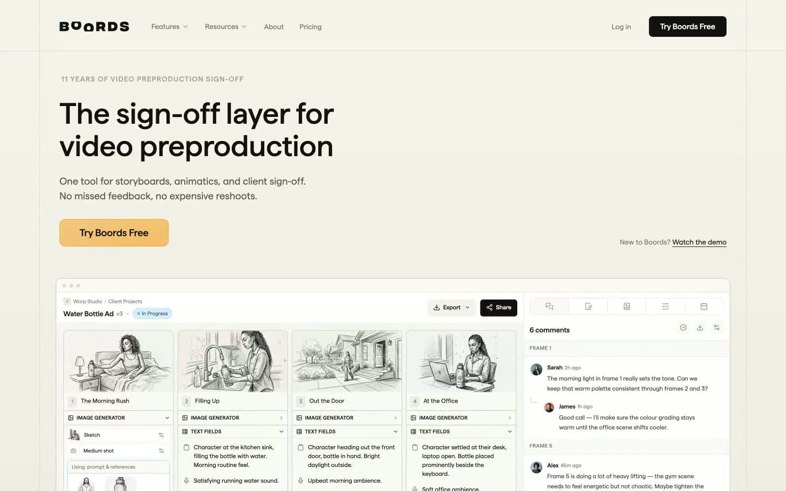
boords.com. A cream canvas, amber pencil accents, and flat geometric type that feels hand-drawn even when it's pure UI.
- SaaS
- Light theme
- 13 colors
- 2 typefaces
Boords operates in a warm, paper-like visual register: a cream canvas (#fafaf5) sits beneath pure white surfaces, with a single amber accent that feels more like a pencil highlight than a digital CTA. The custom 'matter' typeface carries a geometric, friendly character at every scale, with positive tracking on small-caps eyebrows and tight, confident headlines at 32–60px. The interface is deliberately flat — 6px corners are the default radius, shadows are nearly absent, and one dark section (the developer/API area) breaks the cream monotony without disrupting the calm. The aesthetic borrows from the storyboard world it serves: warm neutrals, soft radii, amber-warm action colors, and a hand-drawn quality in the product imagery that makes the UI feel like a creative tool rather than a productivity app.
boords.com design system

Brand3
Primary CTA buttons, active state highlights — the amber pencil-mark accent that makes the single action feel warm and inviting rather than corporate
Orange decorative accent for icons, marks, and small graphic details. Do not promote it to the primary CTA color
Yellow decorative accent for icons, marks, and small graphic details. Do not promote it to the primary CTA color
Accent2
Blue accent for outlined action borders, linked labels, and lightweight interactive emphasis
Hairline borders, dividers, input outlines, and card edges on light surfaces
Neutrals8
Primary text, dark section background, filled nav button, high-contrast borders
Secondary text, muted body copy, supporting labels
Tertiary text, icon strokes, disabled states, caption metadata
Placeholder text, subtle borders, low-emphasis text
Hairline borders on cards, dividers between sections, table separators
Section dividers, subtle alternating surfaces, input field backgrounds
Page canvas, base surface — replaces pure white to give the interface a paper-like warmth
Card surfaces, product UI panels, elevated content blocks
Try a pairing
Pick any two colors from the palette to check whether text stays readable on top.
Aa
Ink Black on Warm Gold
9.15 : 1 contrast
- Body textPasses AA 4.5
- Large textPasses AA 3
- StrictPasses AAA 7























