
Beau. Confident monochromatic editorial with a single theatrical gradient spotlight.
- SaaS
- Light theme
- 7 colors
- 1 typeface
Beau operates as an editorial broadcast booth for client documents: a warm-paper canvas, confident near-black ink, and one theatrical orange-to-indigo gradient that acts as a spotlight. The system is aggressively monochromatic — color is rationed to the point of ceremony, reserved for product frames, feature pills, and one section-width wash. Typography does almost all the expressive work via tight Geist tracking and a narrow 400/500 weight axis, creating a hushed but authoritative voice. Surfaces are flat and matte with whisper-quiet 6px corners; the only soft shadow is a 2px atmospheric haze. Buttons are fully pill-shaped (200px radius), making even the smallest interaction feel like a broadcast button on a studio console.
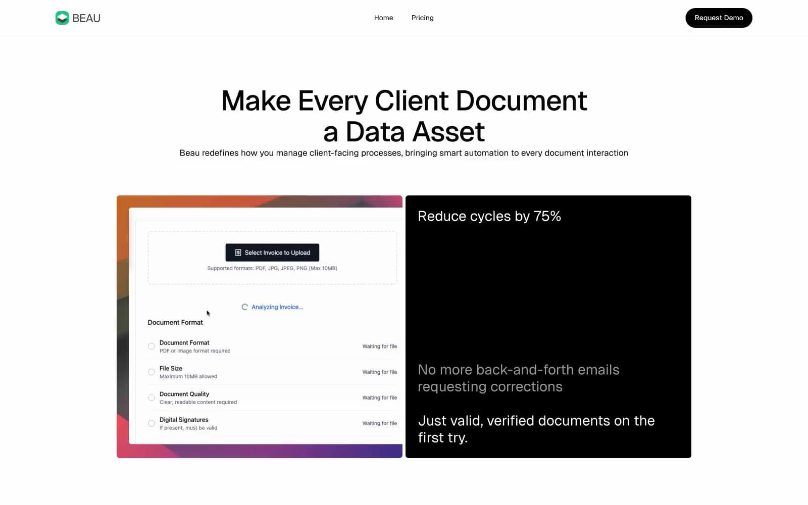
Beau design system

Accent1
Signature accent — used only for product screenshot frames, feature pill backgrounds, and the one full-width section wash; the gradient itself carries the brand voice, so the orange leading stop represents it in solid form
Neutrals6
Primary text, dark feature card surfaces, filled pill button background, hairline borders — the structural backbone of every screen
Secondary text, muted helper copy, quiet borders on neutral sections
Tertiary metadata, section subtitles, low-emphasis text
Disabled badge fill, very low-emphasis surface washes
Alternate section surface — gives the cream/ivory warmth that stops the page from feeling clinical
Primary page canvas, card surfaces, button text on dark fills
Try a pairing
Pick any two colors from the palette to check whether text stays readable on top.
Aa
Paper White on Ink Black
21.00 : 1 contrast
- Body textPasses AA 4.5
- Large textPasses AA 3
- StrictPasses AAA 7























