
Ballpark. Editorial white studio, single vermilion flare.
- SaaS
- Light theme
- 18 colors
- 4 typefaces
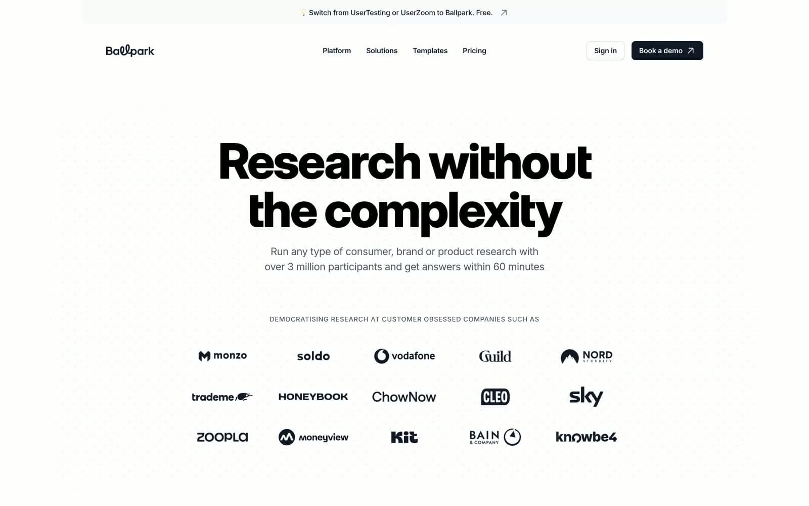
Ballpark uses a confident, editorial research-platform language: a near-pure white canvas, oversized grotesque display headlines, and a single warm vermilion accent (#fc4a2b) that fires across borders, highlights, and icon strokes. The system feels quiet by default — almost every surface is white or whisper-gray — and lets the orange act as a small, functional flash against monochrome typography. Components are flat and pill-leaning: floating rounded tags, hairline-bordered cards, and a dark CTA that grounds the page against the airy type. The result reads like a magazine spread that happens to be a SaaS homepage — weight, scale, and one chromatic note doing all the work.
Ballpark design system

Brand2
Brand accent — borders, highlight strokes, icon fills, small inline emphasis marks. The only saturated color in the system; appears as punctuation, never as a wash; Brand-to-tint linear gradient — appears as a full-bleed color bar behind embedded product screenshots
Deeper vermilion variant — icon glyphs and small filled marks where the primary accent needs more weight against white
Accent7
Secondary warm accent — decorative strokes and illustration outlines that sit beside the primary vermilion
Soft warm fill — subtle wash backgrounds, shadow tints that carry the brand's warmth without screaming
Tinted surface — warm-tinted card or section background, barely-there warmth to differentiate from neutral gray
Lightest warm tint — badge fills, tag backgrounds, and hover surfaces that need warmth without saturation
Red supporting accent for decorative details and low-frequency emphasis. Use as a supporting accent, not as a status color
Green supporting accent for decorative details and low-frequency emphasis. Use as a supporting accent, not as a status color
Decorative warm gradient — used behind product imagery to extend the brand's warmth into visual sections
Neutrals9
Headlines, body text, filled dark buttons, the heaviest typographic weight in the system
Supporting neutral for secondary UI, dividers, and muted labels.
Secondary headings and body emphasis where Slate 600 is too light
Body text, paragraph copy, secondary descriptions, link text
Tertiary text, captions, icon strokes at reduced weight, disabled labels
Hairline dividers, card borders, input outlines at rest
Elevated surface — card backgrounds that sit on the Fog band, subtle inputs, and table row alternation
Section background — the quietest gray band used to separate content zones from the pure white canvas
Primary canvas, card surfaces, button text on dark fills
Try a pairing
Pick any two colors from the palette to check whether text stays readable on top.
Aa
Ink Black on Ember Pulse
5.06 : 1 contrast
- Body textPasses AA 4.5
- Large textPasses AA 3
- StrictFails AAA 7























