
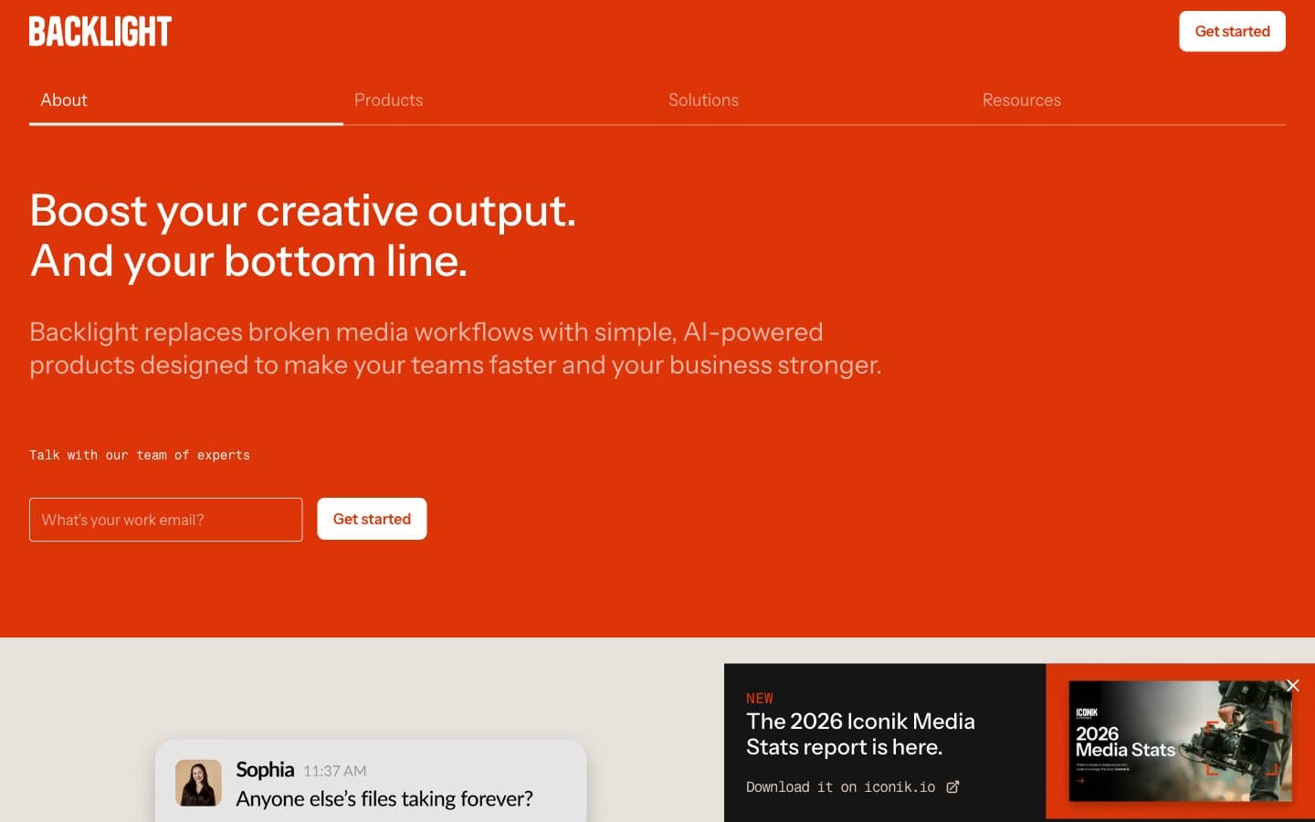
Backlight. A printed catalog cover where one ink red commands the cream page and everything else stays in quiet grayscale.
- SaaS
- Light theme
- 9 colors
- 2 typefaces
Backlight uses a warm editorial language built on cream vellum and one vermillion accent. The full-bleed orange-red hero acts as the cover page of a printed catalog, with white type and a single white pill button as the only allowed elements. Below the hero, the canvas shifts to warm cream (#e4ddd5) carrying white cards, dark text, and a thin peach hairline (#f3b8a9) that traces the grid like a printer's rule. Chat-bubble cards are used as a signature device to dramatize team conversations and pain points. The type system is confident but quiet — Instrument Sans with consistent negative tracking creates density without weight, and Fragment Mono punctuates timestamps and metadata. The palette never escalates: no shadows, no gradients, no secondary accents — just warm neutrals, one bold red, and a single full-bleed black band for tonal contrast.
Backlight design system

Brand2
Orange accent for outlined action borders, linked labels, and lightweight interactive emphasis. Do not promote it to the primary CTA color
Orange outline accent for tags, dividers, and focused UI edges. Do not promote it to the primary CTA color
Neutrals7
Icon fills, tight border accents, true-black for print-style contrast moments
Primary headings, body text, dark section backgrounds, chat bubble fills, button borders on light — the heavy type and the rare full-bleed dark band
Link text on light surfaces, image strokes, secondary borders
Card borders, secondary text, muted UI rules — the mid-neutral that softens edges between Bone White and Midnight Ink
Badge backgrounds and borders, secondary surface tint — a warm neutral tag fill that sits between cream and peach
Page canvas below the hero, input borders, soft surface washes — the warm paper stock everything else sits on
Card surfaces, button fills on the orange hero, nav text on dark/orange, inverted typography — the bright surface layer
Try a pairing
Pick any two colors from the palette to check whether text stays readable on top.
Aa
Press Black on Vermillion
4.59 : 1 contrast
- Body textPasses AA 4.5
- Large textPasses AA 3
- StrictFails AAA 7























