
Baba. Care notes in red sunlight.
- SaaS
- Light theme
- 10 colors
- 2 typefaces
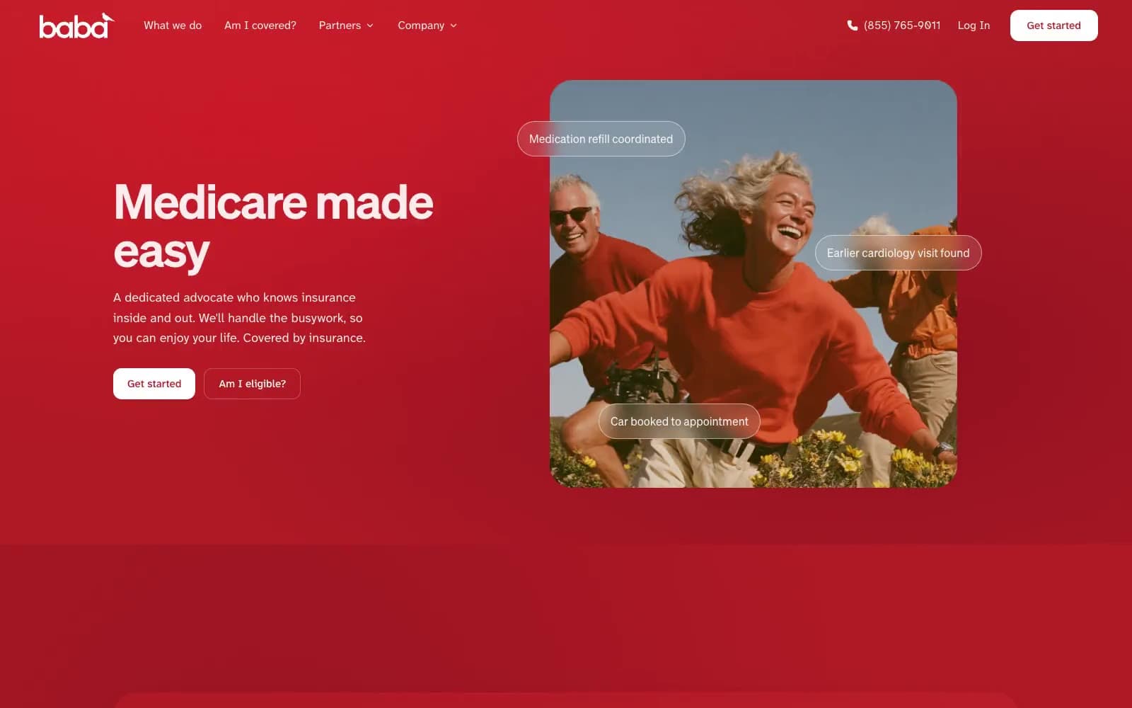
Baba pairs an expansive red advocacy field with a warm cream information canvas. Söhne display type is large, tightly tracked, and weighty; Atkinson Hyperlegible Next keeps navigation, answers, and care details unusually legible at small sizes. White and blush panels interrupt the red field, while rounded photographic crops, translucent status pills, and deep wine-tinted shadows turn care coordination into a visible, human scene.
Baba design system

Brand2
Large campaign bands, footer surfaces, branded links, icons, and red-on-white labels — the deep warm red establishes the site’s continuous care-setting atmosphere; Layer behind large red campaign panels and animated care-plan scenes
Lighter red panel illumination and gradient endpoint within red feature sections
Accent2
Filled conversion controls on light navigation and cream surfaces — the brighter red reads as a precise interruption within the warmer red system
Soft feature-card surfaces and calm transitional blocks between cream content sections
Neutrals6
Primary dark headings, body copy, dark controls, and dark feature-card surfaces
Long-form body copy and secondary explanatory text
Muted supporting copy and low-emphasis labels
Hairline accordion rules, quiet control borders, and light-surface separation
Page backgrounds, pale outlined controls, and light-on-dark typography
Cards, light navigation controls, image badges, and high-contrast text on red surfaces
Try a pairing
Pick any two colors from the palette to check whether text stays readable on top.
Aa
#111111 on Red Light
4.71 : 1 contrast
- Body textPasses AA 4.5
- Large textPasses AA 3
- StrictFails AAA 7























