
AutoSend. Where serif headlines and electric-indigo CTAs share the same quiet off-white room.
- SaaS
- Light theme
- 14 colors
- 5 typefaces
AutoSend reads like a warm-technical workspace: a stone-warm off-white canvas, restrained chrome, and one vivid electric-violet accent that makes actions feel switched on. The hero headline is a Cooper serif at near-display size, pairing upright with italic for a single emphasis word — this humanist serif is the anti-Sans-Helvetica SaaS move and defines the page's voice. UI chrome stays monochrome and calm; color is punctuation, not wallpaper, appearing on the CTA, card borders, and icon strokes. Components are flat and weightless: 8–16px radii, hairline stone borders, and a single soft drop shadow reserved for elevated product surfaces.
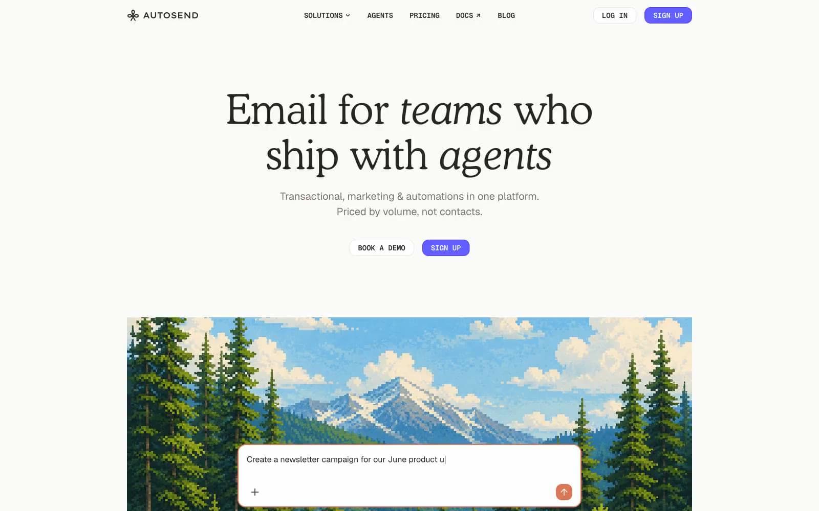
AutoSend design system

Brand2
Primary CTA fill, active links, brand marks — the singular chromatic accent that makes the sign-up button feel switched on
Hover and pressed states for Electric Indigo, decorative borders, illustration strokes
Accent5
Secondary accent — warm orange used sparingly on card borders, decorative icons, and highlight strokes to soften the indigo/grey palette
Green outline accent for tags, dividers, and focused UI edges. Use as a supporting accent, not as a status color
Teal decorative accent for icons, marks, and small graphic details. Use as a supporting accent, not as a status color
Red accent for outlined action borders, linked labels, and lightweight interactive emphasis. Use as a supporting accent, not as a status color
Standard text links within body copy — the one blue that behaves like a link
Neutrals7
Deepest text and edge cases requiring maximum contrast
Primary text, headings, active nav, dominant border color — the near-black that carries every important word
Muted body text, secondary labels, icon strokes, placeholder copy — warm rather than cool grey
Tertiary text, disabled states, subtle icon tints
Hairline borders, dividers, button outlines, list separators — the structural linework that holds the layout together
Page canvas, button secondary fills, section backgrounds — the warm off-white that prevents the page from feeling clinical
Card surfaces, elevated panels, primary button text, input fills — layered above Warm Bone for subtle separation
Try a pairing
Pick any two colors from the palette to check whether text stays readable on top.
Aa
Paper White on Electric Indigo
4.58 : 1 contrast
- Body textPasses AA 4.5
- Large textPasses AA 3
- StrictFails AAA 7























