
August Health EHR. A humanist clinical surface that softens healthcare's typical sterility.
- SaaS
- Light theme
- 14 colors
- 2 typefaces
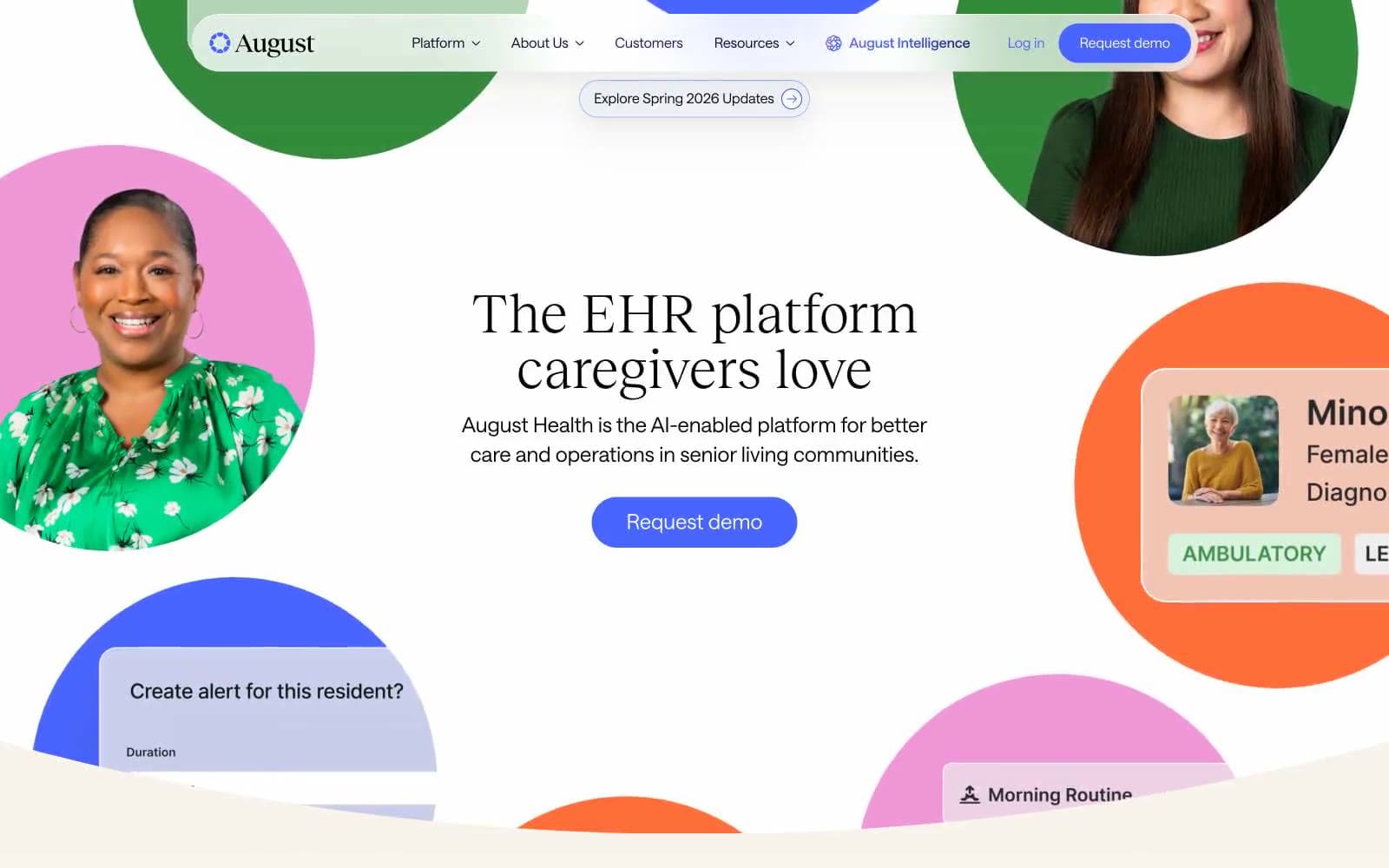
August Health uses a warm-clinical visual language: a soft cream canvas (#f8f3eb) replaces the cold white typical of healthcare SaaS, and shadows are tinted with warm brown rgba(75,68,57,0.1) rather than cool gray. The pairing of an editorial serif (Reckless Neue) with a geometric sans (Saans) gives the product an approachable, humanist feel appropriate for senior care, while a vivid indigo (#4865ff) anchors all primary actions. Color appears in concentrated bursts — circular portrait frames, tinted feature cards, and pill buttons — against an otherwise restrained neutral palette, creating rhythm and warmth without overwhelming the interface.
August Health EHR design system

Brand4
Primary action buttons, active nav state, icon accents — the single saturated focal color that makes CTAs unmistakably interactive
Headlines, body text, primary borders — near-black violet that pairs warmth with the serif typeface
Navigation borders, secondary surfaces, gradient terminus — darker sibling to Primary Indigo for layered depth
Outlined/ghost button borders, subtle violet washes — soft tint version of Primary Indigo
Accent5
Green action color for filled buttons, selected navigation states, and focused conversion moments
Tinted card surfaces, portrait frame backgrounds — warm orange that signals energy and human warmth
Tinted feature card backgrounds, hero photo frame — mid-pink for category-coded surfaces
Light pink surface washes and button backgrounds — lightest tint in the pink family for soft fills
Dark green button background variant — deep saturated green for contrasting pill buttons
Neutrals4
Primary text, maximum-contrast borders, heading strokes
Link and icon text — slightly lighter than pure black for secondary text
Page canvas, section backgrounds, link surfaces — the warm off-white base layer that defines the entire mood
Card surfaces, button text, inverted elements — the clean surface that sits on top of cream
semantic1
Badge backgrounds for informational tags — near-gray blue for low-emphasis status indicators
Try a pairing
Pick any two colors from the palette to check whether text stays readable on top.
Aa
Pure White on Primary Indigo
4.58 : 1 contrast
- Body textPasses AA 4.5
- Large textPasses AA 3
- StrictFails AAA 7























