
Augen Pro. Clinical, weightless, electric blue as single accent in monochrome void.
- SaaS
- Light theme
- 7 colors
- 1 typeface
Augen Pro operates in a clinical-white void anchored by deep charcoal typography and one precise electric blue. The entire system reads as a high-end consumer tech brand: sparse, weight-350 type, pill-shaped interface elements floating in near-infinite negative space, and zero decorative chrome. Color is rationed — blue appears only as functional borders on links and tags, never as fills, giving the interface a cool, instrument-panel quality. The layout breathes vertically with 90+px section gaps and max-width centering, creating an editorial rhythm that treats every section like a spread.
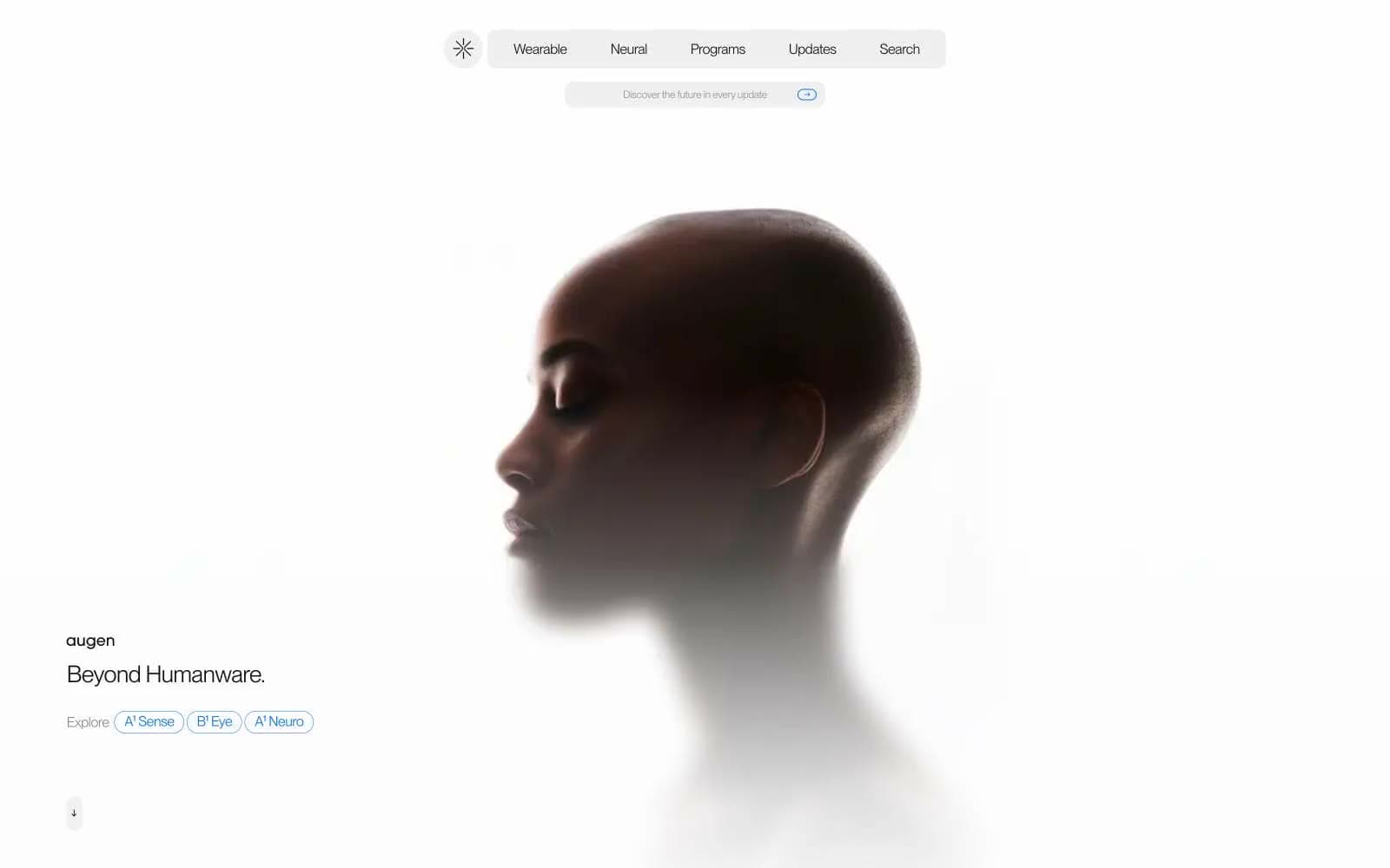
Augen Pro design system

Brand1
Blue outline accent for tags, dividers, and focused UI edges. Do not promote it to the primary CTA color
Neutrals6
Secondary text, icon strokes, emphasis fills where maximum contrast against white surfaces is needed
Primary text, hero and footer backgrounds, icon fills — near-pure black with a barely-perceptible cool cast that keeps it from feeling dead
Muted body text, captions, inactive labels — meets AA at 6.4:1 for readable but clearly secondary content
Disabled button text, tertiary helper text, very low-emphasis labels
Page canvas, card surfaces, large background fills — the signature light that carries the entire light theme
Elevated card surfaces, input backgrounds, secondary panels — brighter than the canvas for subtle layering without shadows
Try a pairing
Pick any two colors from the palette to check whether text stays readable on top.
Aa
Pure White on Signal Blue
4.62 : 1 contrast
- Body textPasses AA 4.5
- Large textPasses AA 3
- StrictFails AAA 7























