
Audyr. Ink on cold-pressed paper.
- SaaS
- Light theme
- 10 colors
- 1 typeface
Audyr uses a typeset-document language: white paper canvas, black ink text, and the faintest gray rules separating content blocks. The entire interface is intentionally near-monochrome — no brand color accent, no decorative gradients, no illustrated atmosphere — so the product's promise of clarity becomes the page's visual promise too. Typography carries all hierarchy through a single sans-serif (Inter) at three weights and tight -0.025em tracking that compresses letterforms into confident, compact blocks at every scale. Components are quietly constructed with hairline borders in #ededed, 4–8px radii on interactive elements, and shadows so subtle they read as paper grain rather than elevation. The system feels editorial — closer to a beautifully set technical brief than a typical SaaS landing page.
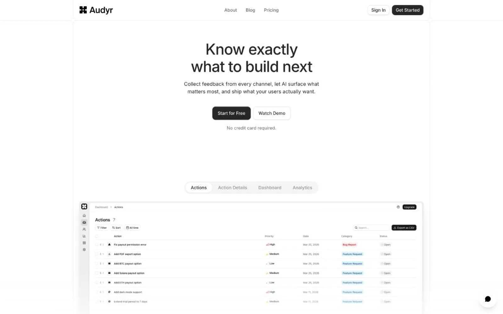
Audyr design system

Accent1
Primary page canvas and white card surfaces. Use as a supporting accent, not as a status color
Neutrals9
Secondary dark surface (pricing card, alternate hero), occasional dark fills where deeper weight is needed than Ink
High-contrast neutral action fill for primary buttons on light surfaces.
Tertiary text, icon strokes on light backgrounds, muted metadata
Secondary body text, nav links, supporting copy — the first step down from primary text
Helper text, caption-level copy, secondary icon strokes
Placeholder text, disabled labels, very low-emphasis text
Shadow residue on dark buttons, ultra-low-contrast surface markers
Hairline borders, input outlines, dividers, subtle panel fills — the structural glue that separates regions without lines shouting
Card surfaces, elevated panels, content backgrounds — the base canvas color sits one step brighter than the page
Try a pairing
Pick any two colors from the palette to check whether text stays readable on top.
Aa
Charcoal on Mint Whisper
17.02 : 1 contrast
- Body textPasses AA 4.5
- Large textPasses AA 3
- StrictPasses AAA 7























