
Zeus Jones. A page that prints like a zine and loads like a gallery.
- Studio
- Light theme
- 5 colors
- 2 typefaces
Zeus Jones operates on an editorial broadsheet language: a warm cream canvas carries the entire site while one near-black ink (#1a1c2c) does all the typographic and interactive work. The signature move is weight 100 display type at 60–90px — headline copy that whispers rather than shouts, a deliberate inversion of the agency-website reflex to use bold display sans. Interactive elements are fully rounded pills; cards, images, and tags share a 20px radius. Shadows are absent — the design uses border weight and type contrast for separation. The hero breaks the monochrome with a single full-bleed aurora of color, but every section below it returns to the quiet cream-and-ink discipline, with underlined sans-serif and serif italic used as editorial emphasis devices.
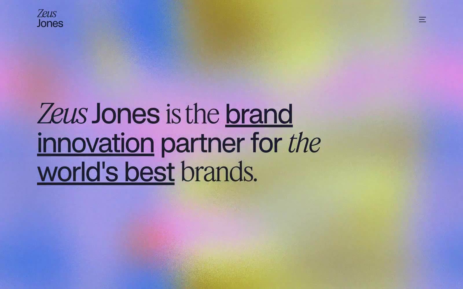
Zeus Jones design system

Accent1
Sporadic warm accent — emerges from the hero aurora and may surface in tag dots or decorative washes; the only warm hue that earns a place in an otherwise cool-neutral system
Neutrals4
SVG icon fills and decorative monochrome marks — reserved for vector assets where true black reads cleaner than the navy-tinted Midnight Ink
Primary text, filled pill buttons, hairline borders, dark surfaces — the only chromatic color in the system; near-black with a barely-perceptible cool navy cast that softens the contrast against warm cream without losing the gravitas of pure black
Elevated card and panel surface — one step darker than the canvas, used sparingly to lift a card or a section band without introducing a new color
Page canvas and light surface base — a creamy off-white that replaces the default SaaS pure-white with paper warmth, making the page feel printed rather than rendered
Try a pairing
Pick any two colors from the palette to check whether text stays readable on top.
Aa
Obsidian on Blush Coral
9.84 : 1 contrast
- Body textPasses AA 4.5
- Large textPasses AA 3
- StrictPasses AAA 7
More DESIGN.md files. Same web, different personalities.

Rauno Freiberg
Studio
Emil Kowalski
Studio

14islands
Studio
19–86
Studio
Aaron Poe & Co
Studio
Acceptandproceed
Studio
ACCOMPANY
Studio
Acolorbright
Studio
Adcker
Studio
Adopt
Studio
Agence Foudre
Studio


