
14islands. A pristine gallery wall where oversized black typography and full-bleed photography exist without decoration, color, or UI noise.
- Studio
- Light theme
- 5 colors
- 2 typefaces
14islands operates as a gallery space for digital work: pure white canvas, near-black text, and a single mid-gray for quiet secondary information. The visual hierarchy is built entirely through scale — display type swells to 180px while body text stays at a disciplined 16px, creating a 10× relationship that feels editorial rather than digital. Components are barely there: hairline borders, 4px corners, no shadows, no chromatic color anywhere in the interface. Photography and full-bleed dark media blocks carry the visual weight that color would in a more conventional system. The single design device that breaks the monochrome discipline is the lighter-gray ampersand or category label — a whisper of contrast that structures typographic relationships without adding hue.

14islands design system

Neutrals5
Primary text, display headlines, full-bleed dark media blocks, nav wordmark — the single near-black that anchors every interface
Muted body text, helper copy, tertiary metadata — deeper than Stone for occasional emphasis on small text
Secondary text, category labels, decorative ampersand, muted button text — the entire chromatic-like hierarchy comes from this one gray
Subtle surface differentiation for alternating sections or inset panels — barely visible, used to create quiet separation without borders
Default canvas, card surfaces, text on dark sections
Try a pairing
Pick any two colors from the palette to check whether text stays readable on top.
Aa
Paper on Ink
20.14 : 1 contrast
- Body textPasses AA 4.5
- Large textPasses AA 3
- StrictPasses AAA 7
More DESIGN.md files. Same web, different personalities.

Rauno Freiberg
Studio
Emil Kowalski
Studio

19–86
Studio
Aaron Poe & Co
Studio
Acceptandproceed
Studio
ACCOMPANY
Studio
Acolorbright
Studio
Adcker
Studio
Adopt
Studio
Agence Foudre
Studio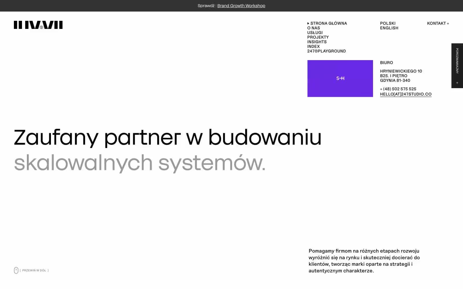
Agencja brandingowa
Studio


