
Yllw. Swiss-Bauhaus print monograph.
- Studio
- Light theme
- 6 colors
- 1 typeface
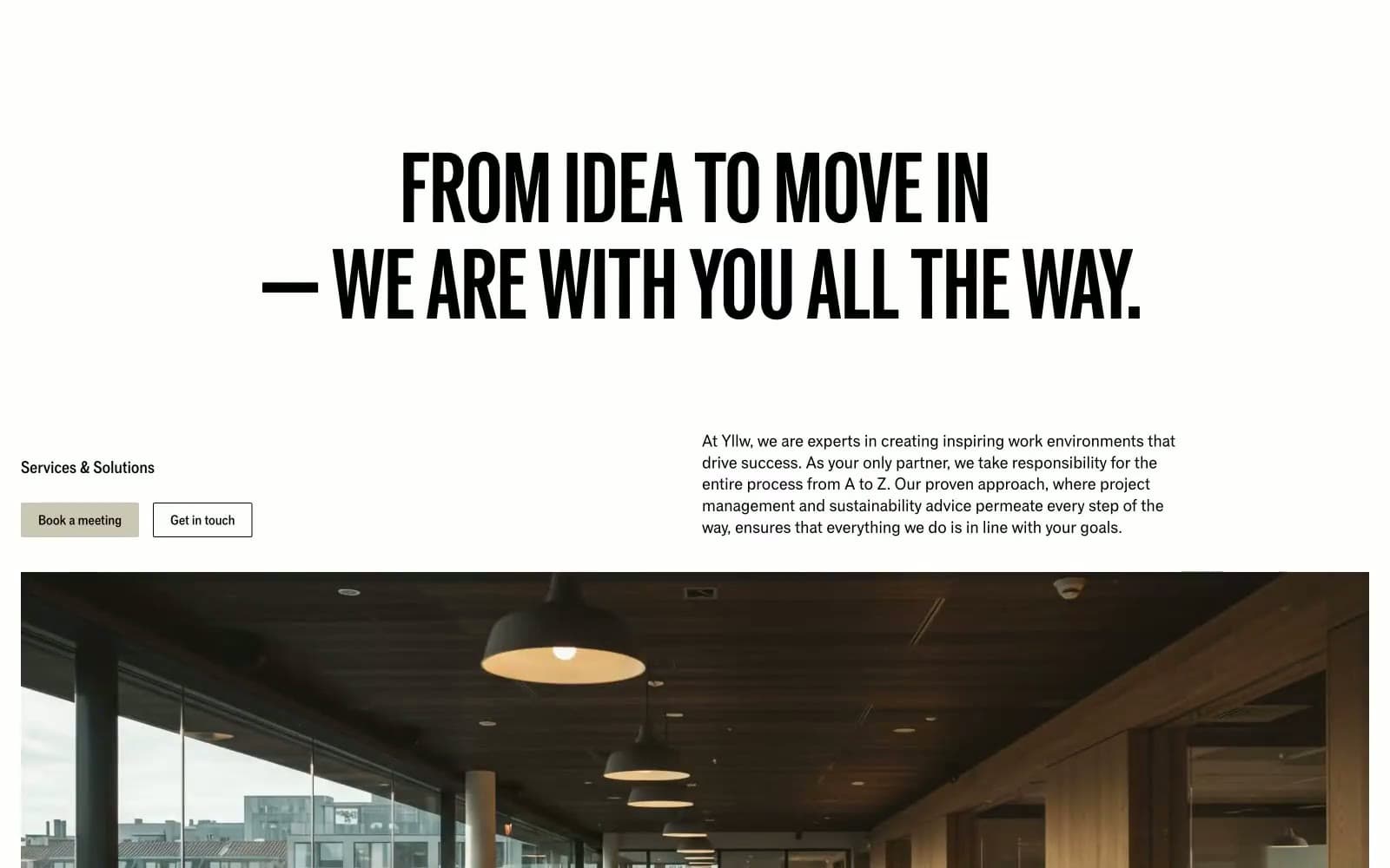
Yllw is an editorial workspace brand: a single variable font pressed into monumental display sizes, a near-grayscale palette anchored by one warm putty neutral, and borders drawn with 1px inset strokes instead of shadows. The page reads like a Swiss-Bauhaus print artifact dropped onto a web canvas — oversized uppercase headlines (often 90–216px) with line-heights pulled tight to 0.88, a dominant putty-stone hue (#cac7b4) that functions simultaneously as canvas, button, and border, and a single signal-yellow announcement bar that acts as the only chromatic punctuation. Components are deliberately raw: 2px corners, hairline rules, no decorative gradients, no elevation depth — every surface is defined by adjacency, not by shadow. New screens should feel like pages from the same printed monograph, not like a product UI.
Yllw design system

Brand1
Light neutral action fill for buttons on dark surfaces.
Accent1
Top announcement bar background, occasional highlight — the only fully saturated color in the system, reserved for time-sensitive messaging and high-visibility callouts
Neutrals4
Primary text, icon strokes, primary borders — the maximum-contrast foreground that does 90% of the typographic and structural work
Secondary dark surface for feature sections and inverted blocks — softer than pure ink, used where a dark band needs to feel like printed stock rather than a screen
Disabled and divider strokes on light surfaces — a third neutral tier between ink and putty for de-emphasized rules
Inverse surface, card backgrounds on darker sections, button text on filled putty buttons, hairline border against putty canvas
Try a pairing
Pick any two colors from the palette to check whether text stays readable on top.
Aa
Ink on Putty Stone
12.34 : 1 contrast
- Body textPasses AA 4.5
- Large textPasses AA 3
- StrictPasses AAA 7
More DESIGN.md files. Same web, different personalities.

Rauno Freiberg
Studio
Emil Kowalski
Studio

14islands
Studio
19–86
Studio
Aaron Poe & Co
Studio
Acceptandproceed
Studio
ACCOMPANY
Studio
Acolorbright
Studio
Adcker
Studio
Adopt
Studio
Agence Foudre
Studio


