
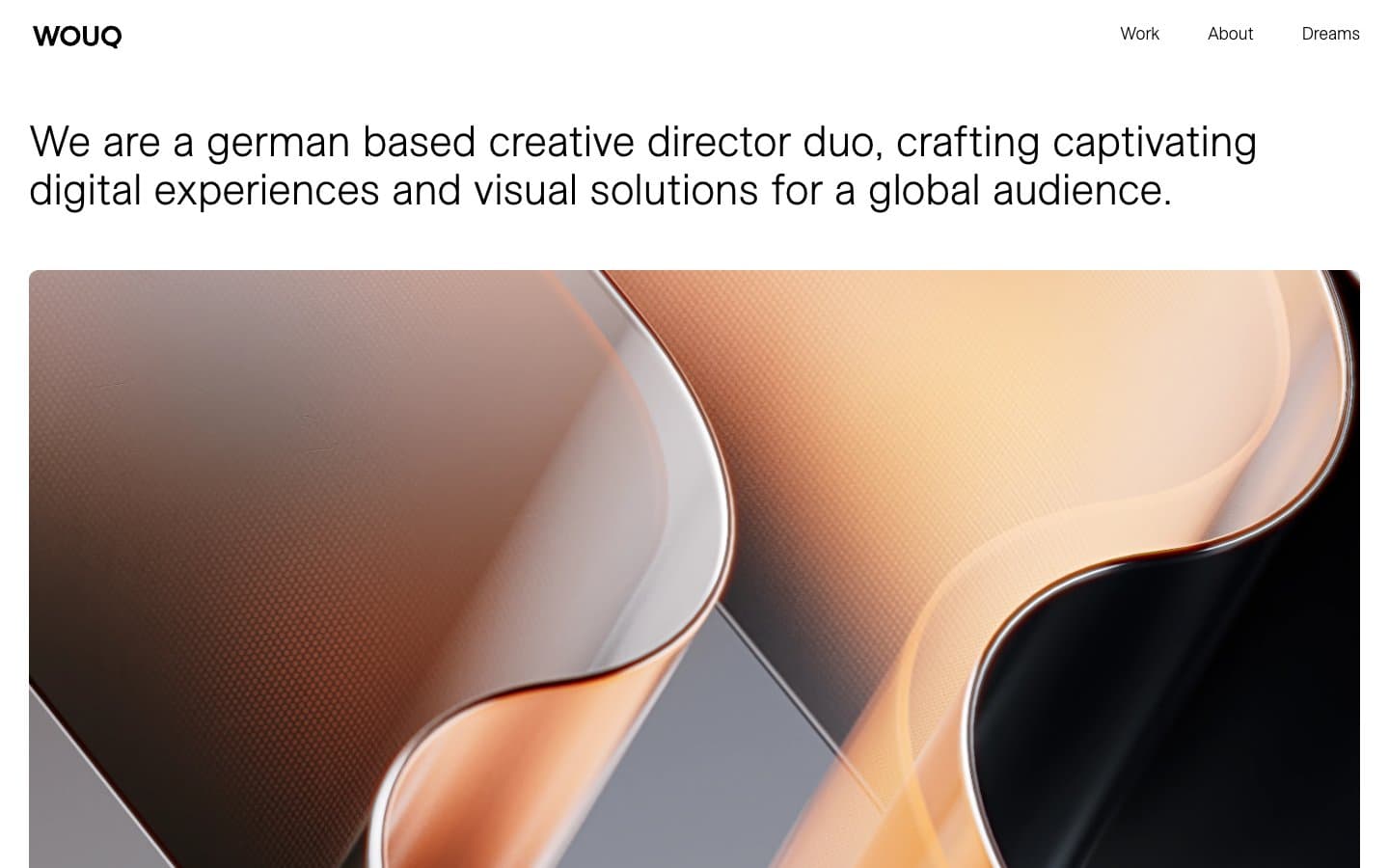
WOUQ. Monochrome gallery wall, museum label typography.
- Studio
- Light theme
- 3 colors
- 2 typefaces
WOUQ operates as a monochrome editorial portfolio: a near-total absence of color, with black text and hairline rules carrying all functional weight on a white canvas. The page is image-forward — large photography and 3D-rendered artwork dominate, treated as gallery objects with a single shared 10px corner radius and minimal chrome. Typography is the only expressive instrument: a custom neo-grotesque face (ESAllianz) is deployed at near-display sizes (45px) for the tagline and category labels, with a tight 1.11 line-height that lets the text stack into editorial blocks rather than breathing room. The interface deliberately removes every non-essential signal — no buttons, no badges, no gradients, no shadows, no accent color — so that the work itself carries the visual identity. Navigation is a plain text row, and project tiles are flat rectangles with two stacked text lines overlaid in a corner, mimicking museum wall labels rather than card UI patterns.
WOUQ design system

Neutrals3
Dark borders and separators for elevated surfaces and inverted UI. Do not promote it to the primary CTA color
Subtle surface variation against white — used at near-imperceptible contrast for stacked layers
Page canvas, card surfaces, and heading backgrounds — the dominant surface across all sections
Try a pairing
Pick any two colors from the palette to check whether text stays readable on top.
Aa
Gallery White on Carbon Black
21.00 : 1 contrast
- Body textPasses AA 4.5
- Large textPasses AA 3
- StrictPasses AAA 7
More DESIGN.md files. Same web, different personalities.

Rauno Freiberg
Studio
Emil Kowalski
Studio

14islands
Studio
19–86
Studio
Aaron Poe & Co
Studio
Acceptandproceed
Studio
ACCOMPANY
Studio
Acolorbright
Studio
Adcker
Studio
Adopt
Studio
Agence Foudre
Studio


