
Worth Agency. Studio gallery at golden hour.
- Studio
- Light theme
- 7 colors
- 3 typefaces
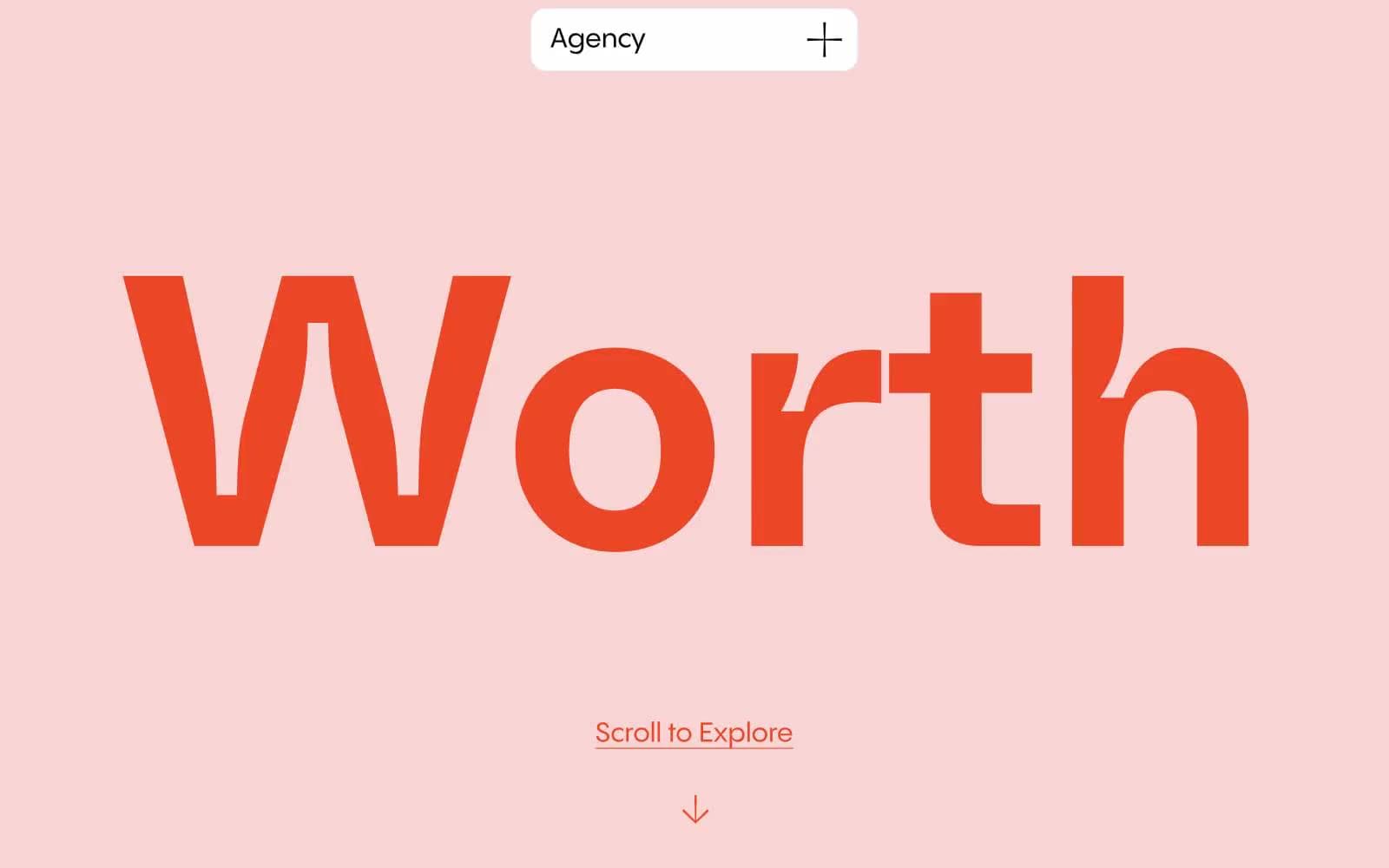
Worth Agency uses an editorial-gallery language: a single warm blush field introduces the brand, then the page surrenders to white space and type. The only chromatic accent is a vivid vermilion (#eb4726) — it marks the colossal custom wordmark, every link underline, and every arrow, making the entire site feel like one typographic gesture. Components are minimal and pill-shaped; a floating top-center tag is the entire navigation system, and there are no buttons anywhere — only underlined text. The aesthetic is confident restraint at exhibition scale: 400px display next to 16px body, flat color blocking instead of shadows, blush and white alternating like gallery walls.
Worth Agency design system

Brand1
Sole chromatic accent — brand wordmark, link underlines, arrow icons, scroll indicator. One warm note against all the near-monochrome
Accent2
Hero section background, full-bleed section dividers, decorative border washes — the warm pastel that sets the emotional temperature for the whole site
Rare card or section background — the only cool note permitted, used sparingly for tonal variety
Neutrals4
Strong borders, high-emphasis text, icon fills — the maximum-contrast neutral
Primary body text, heading text, default borders, icon strokes — the workhorse warm-black neutral
Subtle off-white surface for nested content blocks beneath white sections
Card surfaces, content section backgrounds, floating pill nav fill
Try a pairing
Pick any two colors from the palette to check whether text stays readable on top.
Aa
Jet Black on Vermilion Mark
5.46 : 1 contrast
- Body textPasses AA 4.5
- Large textPasses AA 3
- StrictFails AAA 7
More DESIGN.md files. Same web, different personalities.

Rauno Freiberg
Studio
Emil Kowalski
Studio

14islands
Studio
19–86
Studio
Aaron Poe & Co
Studio
Acceptandproceed
Studio
ACCOMPANY
Studio
Acolorbright
Studio
Adcker
Studio
Adopt
Studio
Agence Foudre
Studio


