Wemakethings. Ink-on-white architecture with type as the only building material.
- Studio
- Light theme
- 2 colors
- 3 typefaces
WeMakeThings operates on a brutally reductive editorial logic: pure black ink on a white paper canvas, with nothing but typography and whitespace to carry the entire visual system. The site reads like a design broadsheet — massive outlined display type acts as architectural scaffolding behind bold all-caps headlines, creating depth and scale without any color, shadow, or imagery. Components are stripped to their skeleton: hairline underlines, thin borders, and direct unadorned type. Density is comfortable with generous margins, and the brand grid uses vertical text columns to turn a simple list into a typographic wall. There is no decoration, no warmth, no gradient — just confident restraint where every pixel earns its place.
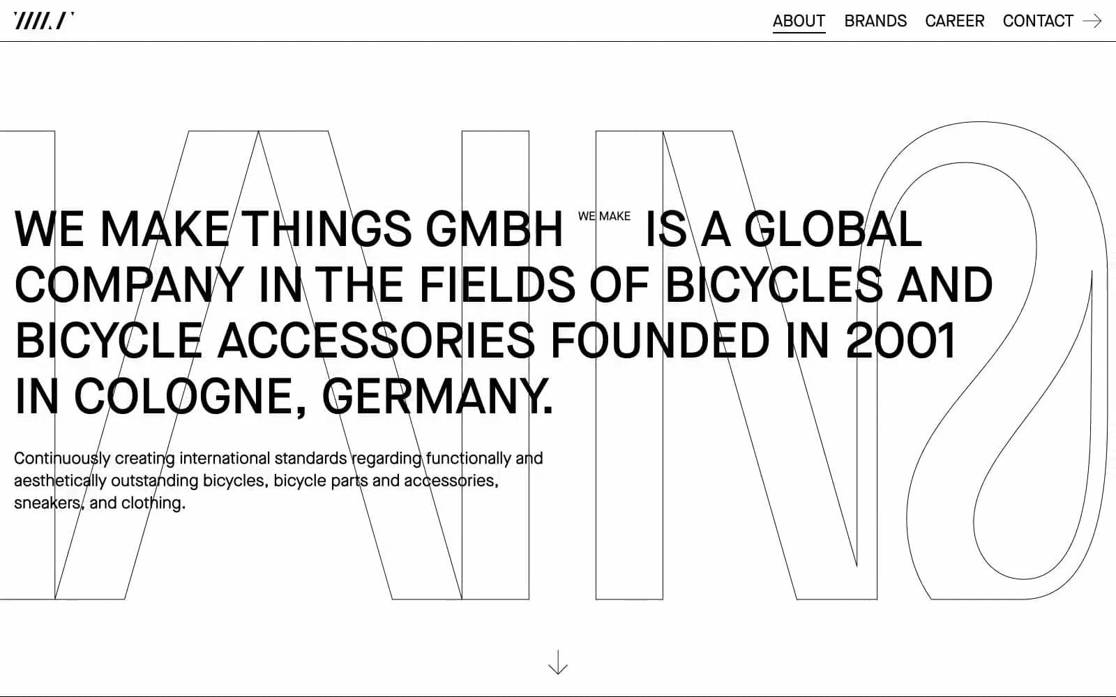
Wemakethings design system
Neutrals2
Primary text, all borders, outline strokes, link underlines, background type fill
Page canvas, card surface, filled button background
Try a pairing
Pick any two colors from the palette to check whether text stays readable on top.
Aa
Paper White on Ink Black
21.00 : 1 contrast
- Body textPasses AA 4.5
- Large textPasses AA 3
- StrictPasses AAA 7
More DESIGN.md files. Same web, different personalities.

Rauno Freiberg
Studio
Emil Kowalski
Studio

14islands
Studio
19–86
Studio
Aaron Poe & Co
Studio
Acceptandproceed
Studio
ACCOMPANY
Studio
Acolorbright
Studio
Adcker
Studio
Adopt
Studio
Agence Foudre
Studio


