
Websmith Studio. Morning light on cream paper.
- Studio
- Light theme
- 8 colors
- 1 typeface
Websmith Studio is a quiet, almost monastic portfolio language built on warm cream paper and one near-black ink. The hero is typographic — a 96px sentence that carries the entire first screen — and everything else retreats to give it room. The interface is 99% achromatic; color appears only as three pastel card surfaces (powder blue, mint, blush) and a single vivid green status dot, used as functional punctuation rather than decoration. Components are flat and borderless, relying on generous whitespace, 12px image radii, and a single dark filled button to create rhythm. The system feels less like a website and more like a printed editorial spread — confident, restrained, and deliberately under-designed.
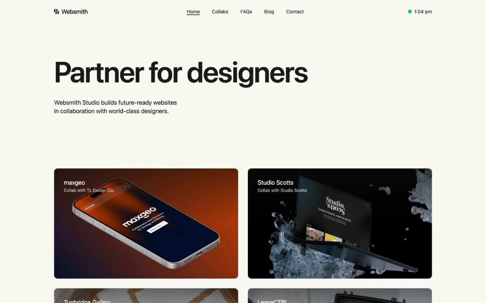
Websmith Studio design system

Brand1
Green wash for highlight backgrounds, decorative bands, and soft emphasis behind content
Accent3
Blue wash for highlight backgrounds, decorative bands, and soft emphasis behind content.
Feature card surface — pastel green used as a category tint in the services grid, always paired with near-black text and an icon
Feature card surface — soft coral used as the third category tint; the warmest of the three pastels, slightly louder on the cream canvas
Neutrals4
Reserved for SVG icon fills — logo glyph and nav icon strokes; rarely surfaces as a background
Primary text, icons, and the filled button — near-black rather than pure black, softer on the warm canvas and used as the sole dark element in the system
Page canvas and base surface — warm off-white that softens the starkness of pure white, giving the whole site a printed-editorial warmth
Elevated card surfaces and the nav bar — sits one step above the cream canvas to create subtle layering without shadows; White text and button labels — used on dark backgrounds and as the light-mode border on neutral card edges
Try a pairing
Pick any two colors from the palette to check whether text stays readable on top.
Aa
Deep Black on Signal Green
9.47 : 1 contrast
- Body textPasses AA 4.5
- Large textPasses AA 3
- StrictPasses AAA 7
More DESIGN.md files. Same web, different personalities.

Rauno Freiberg
Studio
Emil Kowalski
Studio

14islands
Studio
19–86
Studio
Aaron Poe & Co
Studio
Acceptandproceed
Studio
ACCOMPANY
Studio
Acolorbright
Studio
Adcker
Studio
Adopt
Studio
Agence Foudre
Studio


