Wallpaper Projects. A spread from a 12×16 art monograph where cream stock, near-black ink, and one enormous serif do all the talking.
- Studio
- Light theme
- 4 colors
- 3 typefaces
Wallpaper Projects reads like a high-end art book spread printed on warm cream stock: massive editorial serif type (Cardinal Fruit) set against quiet, paper-warm surfaces, with a single near-black ink doing all the work. The palette is rigorously monochrome — no chromatic accents, no decorative gradients, no shadows — letting the photography and the typographic scale do the heavy lifting. Layout is asymmetric and gallery-paced: full-bleed atmospheric heroes give way to split text+image compositions on cream, with generous negative space acting as the primary structural device. Every interactive element is reduced to a dark pill on warm paper, and the entire system whispers 'considered, expensive, restrained' rather than shouting.
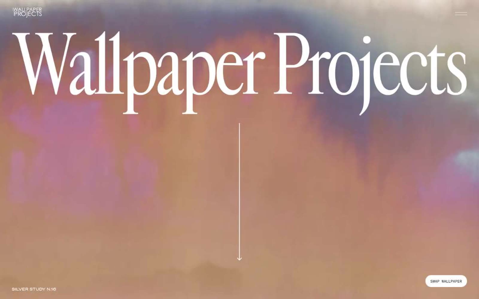
Wallpaper Projects design system
Neutrals4
Maximum contrast moments, occasional true-black text where #1e1e1 isn't dark enough
Primary text, dark pill button fills, borders, heading strokes — the only ink in the system
Alternate surface — the signature cream stock that gives the system its editorial warmth, used for secondary sections and cards
Primary canvas, image backgrounds, button text on dark fills
Try a pairing
Pick any two colors from the palette to check whether text stays readable on top.
Aa
Paper White on Pure Black
21.00 : 1 contrast
- Body textPasses AA 4.5
- Large textPasses AA 3
- StrictPasses AAA 7
More DESIGN.md files. Same web, different personalities.

Rauno Freiberg
Studio
Emil Kowalski
Studio

14islands
Studio
19–86
Studio
Aaron Poe & Co
Studio
Acceptandproceed
Studio
ACCOMPANY
Studio
Acolorbright
Studio
Adcker
Studio
Adopt
Studio
Agence Foudre
Studio


