
Waabi. Concrete monolith with molten-pink ignition.
- AI
- Light theme
- 8 colors
- 2 typefaces
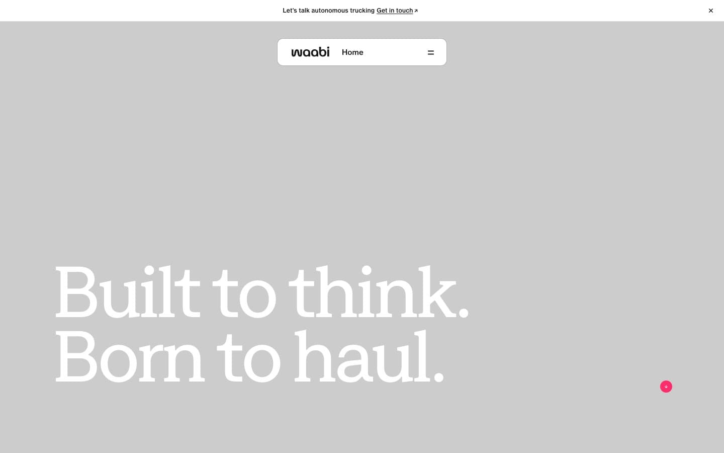
Waabi reads as an editorial-tech manifesto: warm concrete canvas, oversized custom display type set in tight blocks, and a single molten-pink accent that makes every interactive surface unmistakable. The page breathes — most of the canvas is empty warm gray, then content lands as confident white panels or dramatic type. Everything monochrome until you need action, at which point #ff2c6b does the entire job. Components are sparse, pill-shaped, and prefer thin borders and flat surfaces over shadows or gradients. The rhythm is large-to-larger: hero headlines at 130–150px with 0.85 line-height, then a drop to 24–40px for body, creating a magazine-scale hierarchy rather than a UI scale.
Waabi design system

Brand1
Red action color for filled buttons, selected navigation states, and focused conversion moments.
Neutrals7
Pure black for icons and link borders where maximum contrast is required — used selectively, not as a general text color
Primary text, heading text, border lines, icon strokes — near-black with a faint warm cast; the dominant neutral carrying all structural information
Tertiary text, disabled states, inactive borders — sits between Ash and Carbon in the warm-gray scale
Muted helper text, secondary borders, caption labels — warm mid-gray for non-load-bearing information
Cooler secondary card surface, placeholder or empty-state panels — the only cool-tinted neutral, used sparingly to separate distinct UI layers
Page background, hero canvas, section bands — the warm neutral that defines the site's atmosphere; slightly desaturated and warm-toned, not cool gray
Light neutral action fill for buttons on dark surfaces.
Try a pairing
Pick any two colors from the palette to check whether text stays readable on top.
Aa
Ink on Hot Signal
5.82 : 1 contrast
- Body textPasses AA 4.5
- Large textPasses AA 3
- StrictFails AAA 7























