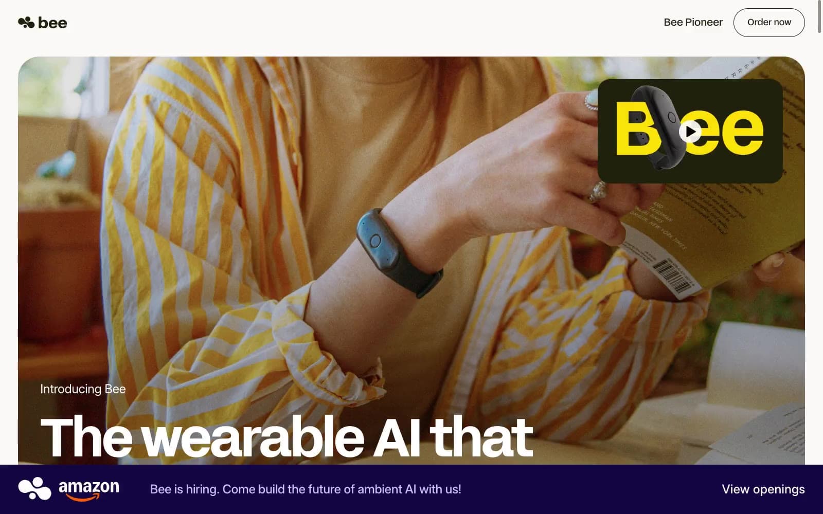
Applied Labs. Sunlit cream paper with cobalt punctuation and floating conversation cards.
- AI
- Light theme
- 17 colors
- 1 typeface
Applied Labs reads like a warm, sunlit editorial spread: cream paper backgrounds, near-black ink type, and a single vivid cobalt blue used as quiet punctuation rather than a shout. The visual signature is the contrast between photographic warmth (real people in real light, not illustrations or 3D renders) and restrained, typographically-driven UI chrome. Conversation fragments — translucent chat bubbles, message exchanges, agent replies — float as a design motif across hero and feature sections, making the product's nature legible without explaining it. Dark filled buttons (espresso-black) are the only hard shapes against the otherwise soft, hairline-divided surface stack; the entire system feels like reading a thoughtful magazine rather than scrolling a product page.

Applied Labs design system

Brand1
Violet text accent for links, tags, and emphasized short phrases. Do not promote it to the primary CTA color
Accent3
Muted blue-gray for section backgrounds, subdued text accents, and image overlay washes — adds cool depth without competing with the cobalt accent
Warm tan card surfaces, trust/social-proof section backgrounds — a near-gray with just enough warmth to echo the photography
Green text accent for links, tags, and emphasized short phrases. Use as a supporting accent, not as a status color
Neutrals13
Primary headings, body text, and icon fills on light surfaces. Do not promote it to the primary CTA color
Primary body and heading text on white, the dominant ink color
Footer and nav text, dark surface accents
Primary text on cream surfaces, dark card accents, outlined action borders — the warm alternative to pure black
Secondary body text, navigation labels, and subdued headings. Do not promote it to the primary CTA color
Secondary body text on cream surfaces
Secondary body text, helper copy, muted descriptions
SVG icon fills, subtle warm-toned decorative elements
Tertiary text, placeholder copy, disabled states
Hairline borders, dividers, input underlines — the structural skeleton of the layout
Elevated card surfaces and subtle section bands
Warm off-white section background, soft card fill — the secondary surface layer that gives the page its paper-like warmth
Page canvas, base card surface, nav background
Try a pairing
Pick any two colors from the palette to check whether text stays readable on top.
Aa
White on Cobalt Spark
5.80 : 1 contrast
- Body textPasses AA 4.5
- Large textPasses AA 3
- StrictFails AAA 7