
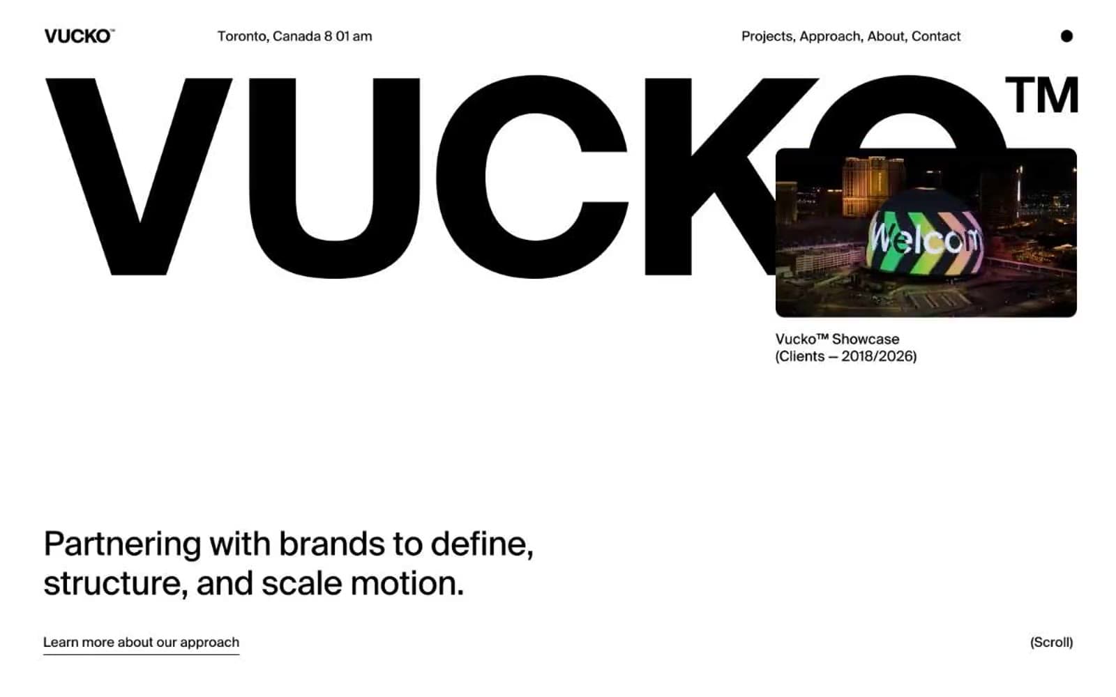
Vucko. A type-specimen book where the wordmark is the room.
- Studio
- Light theme
- 5 colors
- 1 typeface
Vucko operates as a monochrome editorial canvas where the type is the architecture. Pure white surfaces meet pure black ink, with a single faint gray reserved for de-emphasized secondary text and ghost-list items in service lists. The custom Suisse typeface at display sizes — up to 211px — creates a monumental, almost architectural presence where the wordmark alone can fill a viewport. Chromatic color is absent from the system itself, appearing only inside project showcase content (vivid gradients, yellow cards) that punctuates the otherwise austere page. The interface is whisper-thin: hairline 1px borders, zero shadows, generous 58px section gaps, and pill-shaped nav elements. Every screen should read like a page in a high-end art book — restrained, confident, and anti-decoration.
Vucko design system

Neutrals5
Primary text, all borders, dark surface blocks, and the hero wordmark — the structural backbone of every screen
Alternate dark surface for nav or panel backgrounds — a softer dark than Ink when full black is too severe
Muted secondary text and ghost-list items in service lists — the only non-black text color, used to create tonal hierarchy without introducing hue
Subtle surface tint for secondary cards or de-emphasized blocks, barely distinguishable from Paper
Hairline borders, dividers, input outlines, and card edges on light surfaces. Do not promote it to the primary CTA color
Try a pairing
Pick any two colors from the palette to check whether text stays readable on top.
Aa
Paper on Ink
21.00 : 1 contrast
- Body textPasses AA 4.5
- Large textPasses AA 3
- StrictPasses AAA 7
More DESIGN.md files. Same web, different personalities.

Rauno Freiberg
Studio
Emil Kowalski
Studio

14islands
Studio
19–86
Studio
Aaron Poe & Co
Studio
Acceptandproceed
Studio
ACCOMPANY
Studio
Acolorbright
Studio
Adcker
Studio
Adopt
Studio
Agence Foudre
Studio


