
Voicenotes. Cream-paper notebook with a single inkwell.
- AI
- Light theme
- 12 colors
- 3 typefaces
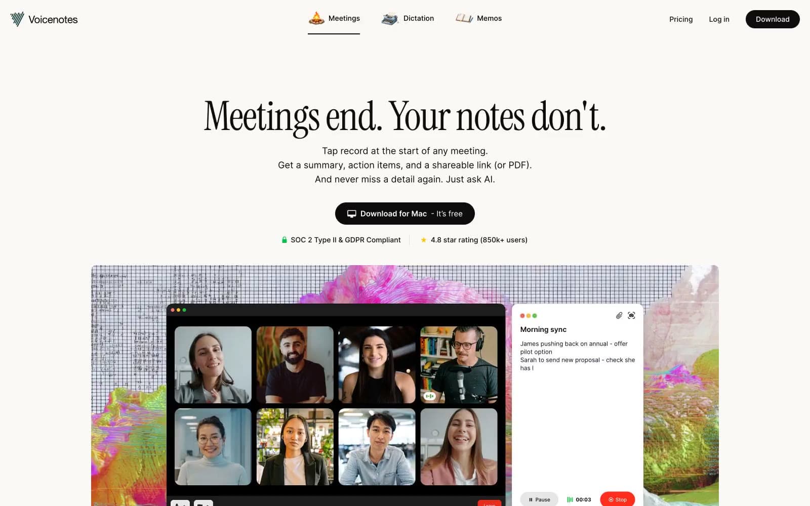
Voicenotes operates as a quiet, editorial note-taking workspace: a warm cream canvas with nearly zero chroma, where the only vivid mark is a single green check used as a tiny trust signal. The visual identity is a conversation between a humanist display serif (Instrument Serif) and a utilitarian sans (Inter) — the serif sings the marketing headlines while the sans does all the interface labor. Components are low-elevation, generously rounded, and pill-shaped for actions, giving every screen the feel of paper notebook pages laid out on a desk rather than a chrome-heavy SaaS dashboard.
Voicenotes design system

Accent1
Green wash for highlight backgrounds, decorative bands, and soft emphasis behind content. Use as a supporting accent, not as a status color
Neutrals11
Body text color, icon strokes, high-contrast outlines — the sharpest dark in the system
Primary action button background, primary navigation text, high-emphasis links — the only dark fill used for interactive elements
Headline text, SVG illustration fills, logo lockup — the warm-tinted near-black for editorial type
Secondary headings and medium-emphasis body text
Muted body text, helper copy, secondary metadata, timestamps, and icon fills at rest
Tertiary text and low-emphasis labels
Secondary borders, card outlines in dense grids, subtle structural dividers
Primary border color for cards, dividers, and input fields — the most-used neutral in the system
Soft section background, alternate surface, and quiet card fill
Page canvas, hero backgrounds, section bands — the warm off-white that makes the whole product feel like paper rather than a screen
Card surfaces, modal backgrounds, elevated panels — pure white sits on top of Parchment to create depth without shadows
Try a pairing
Pick any two colors from the palette to check whether text stays readable on top.
Aa
Jet on Confirm Green
9.46 : 1 contrast
- Body textPasses AA 4.5
- Large textPasses AA 3
- StrictPasses AAA 7























