
Voiceflow. Serif whispers, pill controls glow blue.
- AI
- Light theme
- 15 colors
- 2 typefaces
Voiceflow operates as an editorial product canvas: a generous near-white surface where a whisper-weight serif (Tiempos Headline at 300) carries the voice and a humanist sans (Selecta) handles the machinery. The system is overwhelmingly achromatic — warm off-whites, graphite text, hairline borders — with a single vivid blue (#397dff) that acts as the 'on' switch for primary actions, and a burnt orange (#f55c15) that paints decorative strokes, badge outlines, and icon accents. Components are pill-shaped at the interactive level (999px buttons, 100px nav pills) and softly rounded at the surface level (20px cards), creating a language where controls feel touched and surfaces feel held. The overall rhythm is spacious, confident, and editorial — headlines breathe at 56–64px while body text sits at 16px with generous tracking, producing a magazine-meets-product aesthetic.
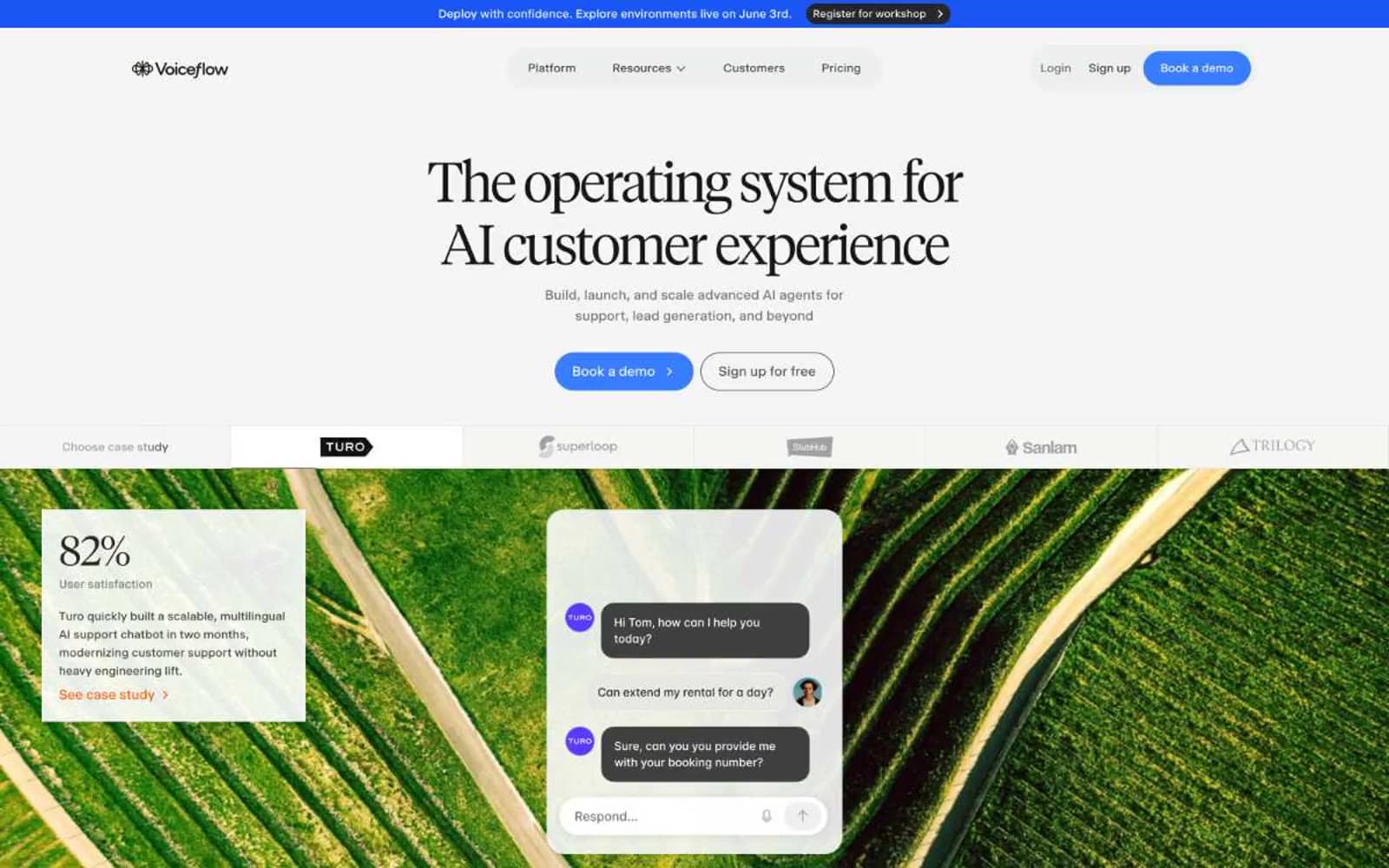
Voiceflow design system

Brand1
Violet action color for filled buttons, selected navigation states, and focused conversion moments.
Accent2
Decorative borders, badge outlines, icon accents — warm orange that warms the cool white canvas without competing with Signal Blue
Red outline accent for tags, dividers, and focused UI edges. Use as a supporting accent, not as a status color
Neutrals12
Display text, deepest heading weight, high-contrast inverse text
Primary text and dark button fills — the near-black that keeps contrast warm
Link text in dark contexts, strong card borders on featured surfaces
Nav text, stronger body text for emphasis without going to black
Secondary text, button borders in outlined controls, sub-label icons
Body text and default neutral borders — the workhorse mid-gray
Muted helper text, disabled labels, low-emphasis icon strokes
Link and secondary border treatment, lighter dividers inside dense blocks
Hairline card and divider borders — defines surfaces without painting them
Nav and section fills that need a barely-there elevation above canvas
Alternate section background, subtle warm-off-white band between content blocks
Page background, card surface, image mask — the baseline white everything else sits on
Try a pairing
Pick any two colors from the palette to check whether text stays readable on top.
Aa
Midnight on Signal Blue
4.74 : 1 contrast
- Body textPasses AA 4.5
- Large textPasses AA 3
- StrictFails AAA 7























