
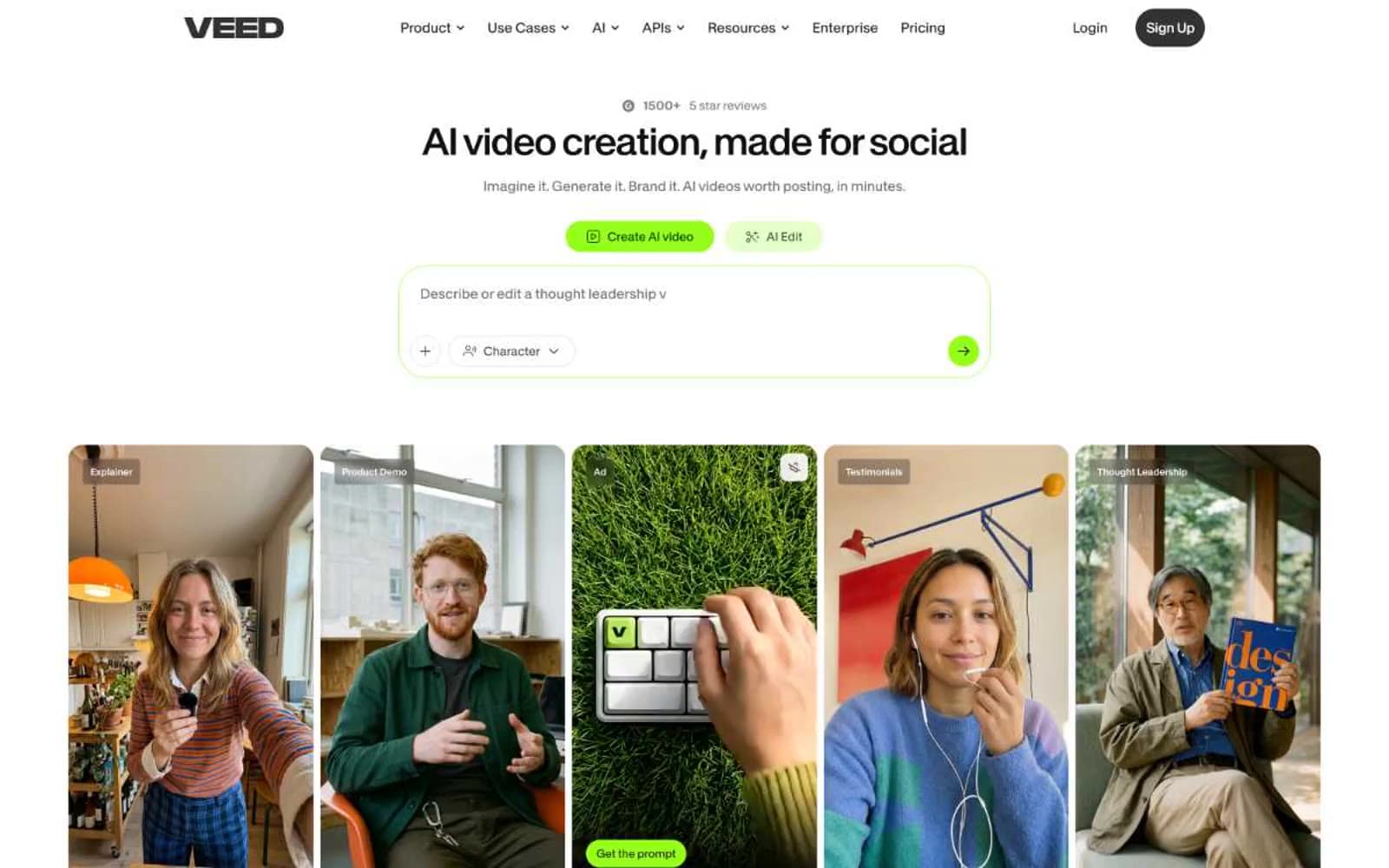
VEED. White gallery wall with neon-green ignition buttons.
- AI
- Light theme
- 14 colors
- 2 typefaces
VEED reads as a creator's studio on a clean white wall: calm matte surfaces, a single electric lime accent that ignites action, and a typographic contrast between a clinical neo-grotesque UI face and an editorial serif that lends unexpected sophistication. The page breathes — generous white canvas interrupted by full-bleed dark bands and large media cards — but the controls themselves stay compact and tool-like, sitting close together inside pill-shaped and softly rounded containers. Color is rationed: greens are reserved for active states, the AI creation prompt, and hero CTAs, while 99% of the interface stays achromatic. The signature move is the interplay between the vivid neon green and the warm near-black text (#0c0a09) — a creator-tool energy crossed with editorial polish.
VEED design system

Brand4
Primary CTA fills, active toggle states, the AI creation prompt accent — an electric green that functions as the brand's ignition switch, impossible to miss on the white canvas
Green wash for highlight backgrounds, decorative bands, and soft emphasis behind content. Do not promote it to the primary CTA color
Deep brand green used for borders, icon strokes, and text on light green washes — the anchor tone that gives the lime palette a grounded counterweight
Subtle tint for secondary button hovers and soft highlight zones — the palest breath of the green family
Neutrals10
Primary heading and body text — a warm near-black with a whisper of brown that pairs with the lime accent without reading as dead-black
Dark section backgrounds, heading text on light surfaces — the deepest neutral for full-bleed dark bands
Dark surface fills, button text on light backgrounds, icon strokes — the primary dark tone for elevated dark sections
Workhorse text, secondary borders, link undertones — the most-used neutral across borders and structural lines
Tertiary borders, icon detail strokes — a bridge tone between slate and charcoal
Icon borders, secondary structural lines — a mid-gray for non-content boundaries
Muted helper text, link borders, placeholder text — the voice of secondary information
Hairline borders on light surfaces, divider lines
Secondary surface fills, button backgrounds on hero areas, subtle tonal dividers
Page canvas, card surfaces, button fills — the dominant light surface
Try a pairing
Pick any two colors from the palette to check whether text stays readable on top.
Aa
Carbon on Lime Spark
15.63 : 1 contrast
- Body textPasses AA 4.5
- Large textPasses AA 3
- StrictPasses AAA 7























