
VALIENTE BRANDS. Signal flare on sun-baked clay.
- Studio
- Light theme
- 3 colors
- 2 typefaces
Valiente Brands is a brutalist broadcast — a single chromatic signal (vivid red-orange) fired across a sun-warmed clay canvas, with almost no UI surface treatment at all. The page is a vertical scroll of oversized monospace-feeling type, corner-pinned navigation labels, full-bleed cinematic video stills, and portrait grids. The aesthetic borrows from emergency signage and typesetter's proof sheets: everything is uppercase, aggressively tracked-negative at display sizes, and stripped of decoration. There are no cards, no shadows, no gradients, no rounded corners — the whole interface reads like a single printed broadside where one color does all the work. White space and type scale do the hierarchy, not containers or elevation.
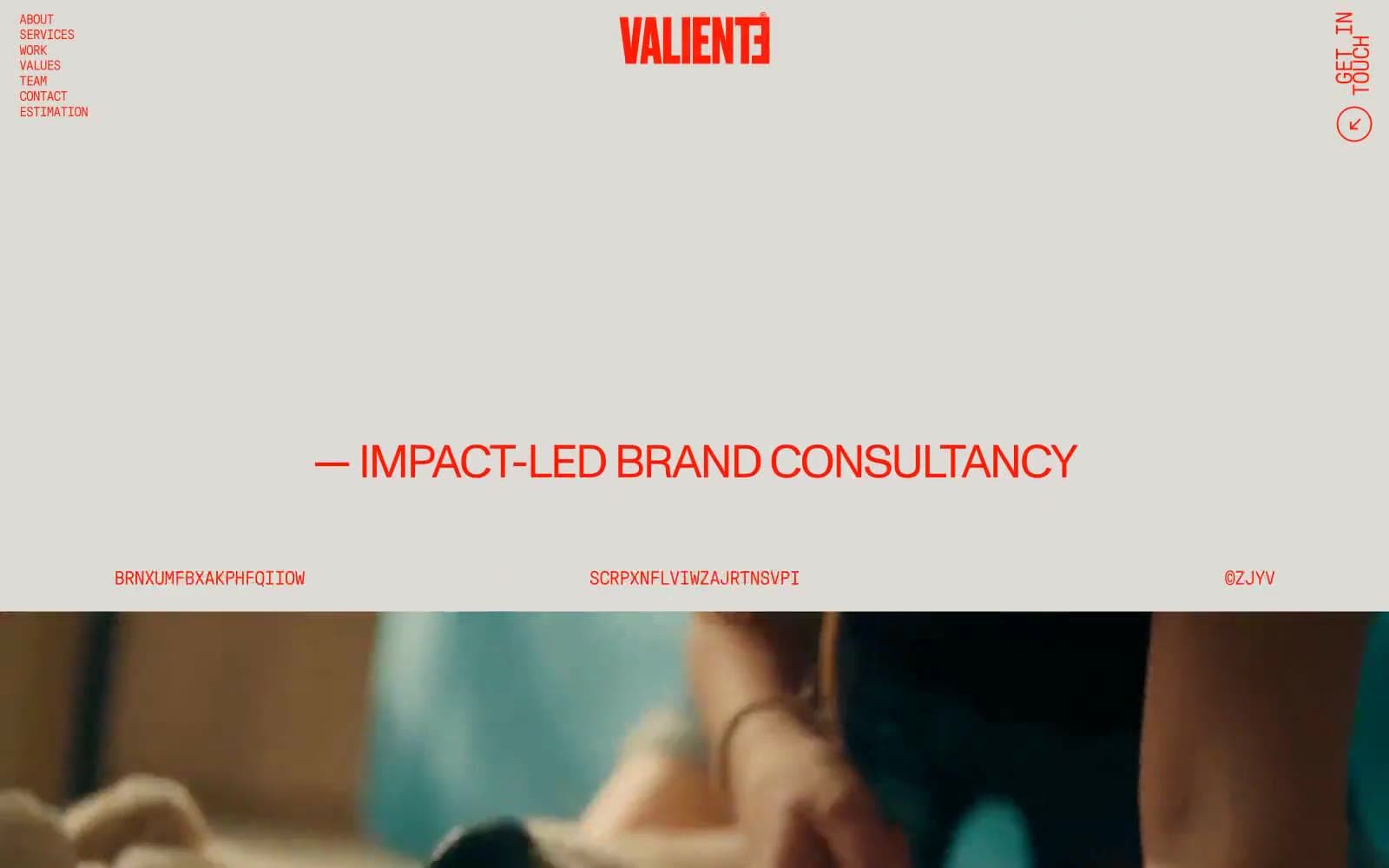
VALIENTE BRANDS design system

Brand1
The only chromatic color in the system — used for logo, all navigation, body text, headings, icons, borders, and the video play affordance. Functions as both brand mark and foreground text color simultaneously
Neutrals2
Reserved for full-bleed video and photography sections only — appears as the dark frame around embedded media, never as a UI surface or text color
Page background — a warm, muted clay-peach that softens the intensity of the red and gives the whole site its heat-shimmer atmosphere. Every default surface sits on this tone
Try a pairing
Pick any two colors from the palette to check whether text stays readable on top.
Aa
Midnight Frame on Signal Flare
5.09 : 1 contrast
- Body textPasses AA 4.5
- Large textPasses AA 3
- StrictFails AAA 7
More DESIGN.md files. Same web, different personalities.

Rauno Freiberg
Studio
Emil Kowalski
Studio

14islands
Studio
19–86
Studio
Aaron Poe & Co
Studio
Acceptandproceed
Studio
ACCOMPANY
Studio
Acolorbright
Studio
Adcker
Studio
Adopt
Studio
Agence Foudre
Studio


