
Traffic. Swiss broadsheet behind a highlighter pen.
- Studio
- Light theme
- 5 colors
- 1 typeface
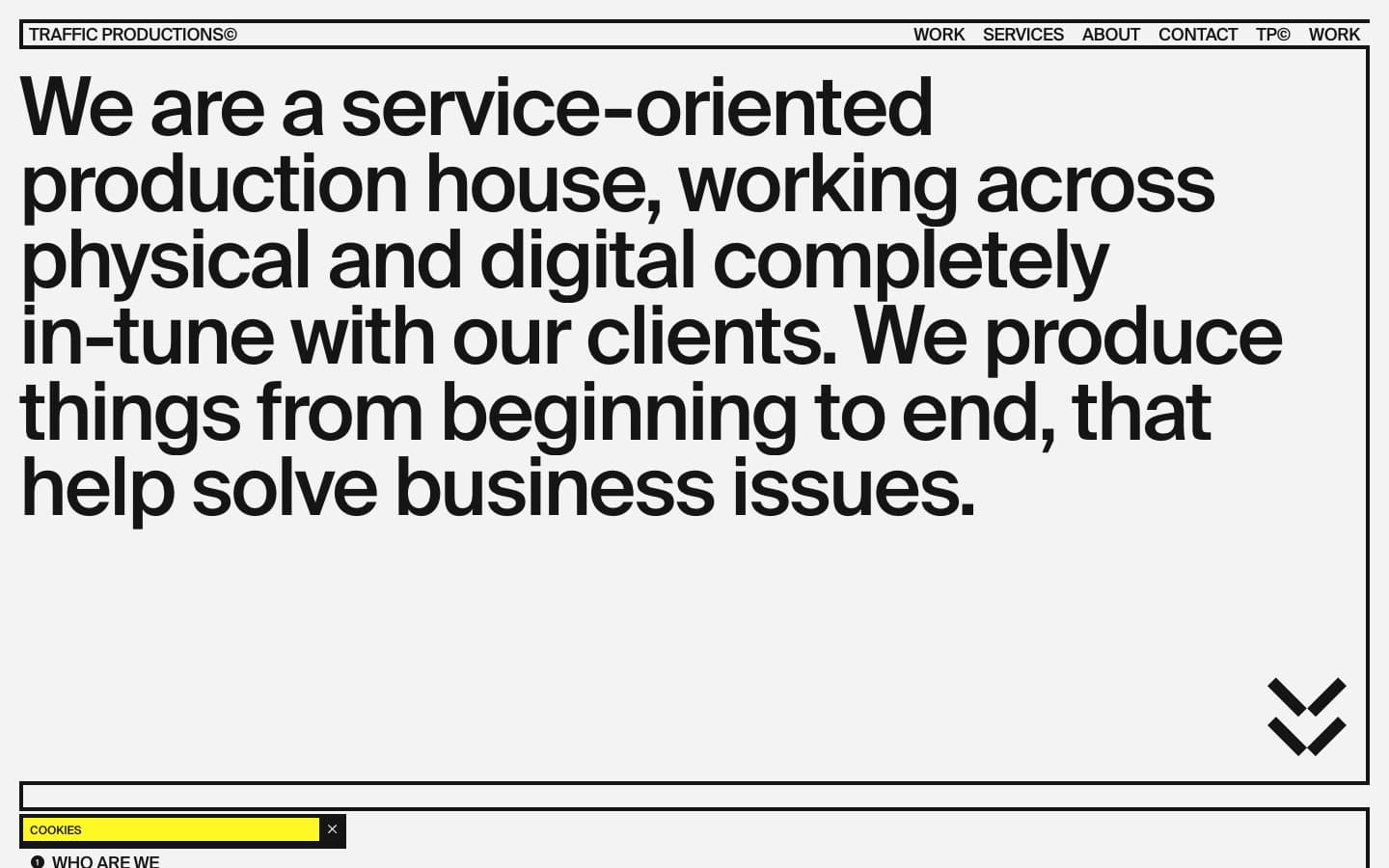
Traffic Productions operates as a typographic poster dragged onto the web: a pale gray canvas framed by hairline black rules, a single fluorescent yellow that behaves like a marker pen, and a single typeface (Suisse) pushed to display sizes of 108px with aggressively negative tracking. The system rejects softness — no shadows, no rounded surfaces (except pill buttons), no gradients, no decorative imagery except monochrome photography treated as raw material. Layout is ruled-grid editorial: content lives inside thin black rectangles like entries in a printed specimen book, and the yellow accent is never decorative — it always labels, highlights, or marks an action. Density is compact, the type scale is extreme, and the overall feel is a Swiss production-house broadsheet that happens to scroll.
Traffic design system

Brand1
Yellow supporting accent for decorative details and low-frequency emphasis. Do not promote it to the primary CTA color
Neutrals4
Icon fills, select structural marks, absolute contrast — used sparingly where maximum black is needed (SVG icon strokes, the heaviest emphasis)
Primary text, all borders and dividers, icons, nav links, button text — the near-black slightly softer than pure #000 used for most typographic and structural marks
Secondary surface tone, subtle differentiation beneath images or within contained blocks
Page background, the off-white ground that prevents the design from reading as stark white — a subtle warmth that lets the black feel printed rather than digital
Try a pairing
Pick any two colors from the palette to check whether text stays readable on top.
Aa
Pure Black on Highlighter Yellow
18.70 : 1 contrast
- Body textPasses AA 4.5
- Large textPasses AA 3
- StrictPasses AAA 7
More DESIGN.md files. Same web, different personalities.

Rauno Freiberg
Studio
Emil Kowalski
Studio

14islands
Studio
19–86
Studio
Aaron Poe & Co
Studio
Acceptandproceed
Studio
ACCOMPANY
Studio
Acolorbright
Studio
Adcker
Studio
Adopt
Studio
Agence Foudre
Studio


